Category Archives: Art Instruction

Painting Out of Your Comfort Zone

Benefits of Painting Out of Your Comfort Zone

Are there benefits of painting out of your comfort zone, or should you just stick to the same subject matter that your accustomed to painting? True, most artists find a niche or genre in which they become known for. Jumping around from one diverse subject to another, doesn’t build a very cohesive body of work. Still, something can be said about pushing your limits.artist looking at easel painting out of your comfort zone

This recently came about with a requested commission painting. My client, had six cats and the last had recently died. She wanted to remember them in a painting that contained a garden scene, a water feature and a few small details including a butterfly, a hummingbird and couple of other birds.  This was no easy task for someone who is primarily a landscape artist. However, in accepting the challenge I realized a few things of which I’ll share.

  1. New Experiences:  By painting out of your comfort zone, you open yourself up to new opportunities, experiences and of course challenges that can help you expand your painting knowledge. My experience with this commission tested my knowledge on perspective and design. Plus I had to do a lot of research on plants and flowers.
  2. Enhanced Creativity: When breaking away from the familiar, it forces your mind to become more adaptable and creative and keeps you engaged.
  3. Skill Acquisition: Challenging subject matter can help you acquire new skills and helps you grow as an artist. No matter how long you’ve been painting.
  4. Self-Discovery:  While you might feel anxious about trying something new, which is natural, the rewards of going beyond your comfort zone can help you realize you can often succeed at doing more than what you thought.

Pushing My Limits

Here’s the commissioned painting. Below the image, is the process that lead to the final painting which was definitely pushing my limits and painting out of my comfort zone.

William Byron Hagerman commissioned painting of cats in a backyard garden scene with a water fountain and flowers

My client sent photos of her cats and of flowers she had in her own garden. However, that doesn’t make a painting. So, the first task was spending time searching images of cats in different poses and using the supplied photos of the actual cats to help with their markings. Also, research was required to identify the different types of plants, flowers, then coming up with a backyard setting.

Once all the reference material was gathered it was now time to sketch out ideas.

Getting Out of My Comfort Zone

In this sketch you can see a few notations of the cats names and where they would be placed. Although the fountain was nice it was bad composition. It pretty much dominated the whole scene. Plus, it was not a good focal area as it was too far to the right.  So, it needed something that didn’t command as much attention. More research was on for other types of wall fountains. Ultimately one was found that was adjusted using other elements from others resources to make it “fit” into the painting. That change also required moving the cats around. Altering one thing can alter the whole. So, you can’t just arbitrarily move something without it effecting something else.

My client also provided details about some of her cats and that one of them liked drinking from fountains. So that had to be included. Another, was to be pawing at a butterfly.  However, when you have any activity going on in your painting, your eye will go to that. So those two cats had to be together and near the water fountain.

So here was the revised sketch.

This image shows a few notations regarding the layout’s design. The arrangement follows some implied lines to lead the eye. The red dots indicated the locations for the cats and possible locations for the other little critters.

Next was finalizing the drawing on a prepared cradled panel using thinned paint.

Even at this stage, there were adjustments made while painting. Some included perspective adjustments and deciding what would be the final plants and flowers to include and which would compliment the scene without being distracting.

Again, here is the final painting. It was done under my Byron signature, which allows me to do other types of work that fall out of range of what I normally paint. My favorite part was painting the elephant ear plant! 🙂

William Byron Hagerman commissioned painting of cats in a backyard garden scene with a water fountain and flowers

So, if your someone who paints, try painting out of your comfort zone. When you do, you might be pleasantly surprised. By the way, my client loved the painting.


Twelve Reasons for Taking an Art Class

Are you looking for a fun and creative way to spend your free time? Do you love nature and art? Do you want to learn a new skill and unleash your inner creativity and express yourself through art? If you answered yes to any of these questions, then you should consider taking an art class. Here are twelve reasons for taking an art class and why it’s a great idea:

  1. You will learn how to observe and appreciate the beauty of nature. Landscape painting teaches you how to pay attention to the colors, shapes, textures, and light of the natural world. You will develop a deeper connection with your surroundings and discover new ways of seeing things.
  2. You will improve your drawing and painting skills. Landscape painting is a challenging but rewarding genre that requires you to master the basics of perspective, composition, value, and color theory. You will also learn how to use different mediums and techniques to create realistic and expressive effects.
  3. You will unleash your creativity and imagination. Landscape painting is not just about copying what you see, but also about interpreting it in your own way. You can experiment with different styles, moods, and themes to convey your personal vision and feelings.
  4. You will have fun and relax. Landscape painting is a great way to enjoy yourself and reduce stress. You can immerse yourself in the process of creating something beautiful and satisfying. You can also share your work with others and get feedback and encouragement.
  5. You will meet new people and make friends. Landscape painting is a social activity that allows you to interact with other like-minded people. You can learn from each other, exchange ideas, and inspire each other.
  6. You will boost your confidence and self-esteem. Landscape painting is a form of self-expression that helps you discover more about yourself and your potential. You will feel proud of your achievements. You will also develop a positive attitude and a growth mindset that will help you in other areas of your life.
  7. Landscape painting has many benefits for your mind and mood. It can improve your concentration, memory, problem-solving, and decision-making skills. It can also lower your anxiety, depression, and boredom levels. It can even stimulate your brain and prevent cognitive decline as you age.
  8. You will expand your horizons and perspectives. Landscape painting encourages you to travel and explore new places, both physically and virtually. You will find inspiration in different landscapes, from mountains and forests to cities and seasides. You will also appreciate the diversity and beauty of our planet.
  9. You can create something meaningful and valuable. Art is not only a form of expression, but also a form of communication. By taking an art class, you can create something meaningful and valuable that conveys your message, vision, or story to others.
  10. You can showcase your talent and achievements. By taking an art class, you can showcase your talent and achievements by displaying your artwork in exhibitions, competitions, or online platforms.
  11. You can support the arts community. By taking an art class, you can support the arts community by contributing to its vitality and diversity.
  12. You will have a fulfilling hobby or career. Landscape painting is a rewarding activity that can enrich your life in many ways. Whether you do it for fun or for profit, you will find joy and satisfaction in creating something meaningful and beautiful.

As you can see, there are many reasons why taking an art class can be a wonderful experience for you.

So what are you waiting for?Oil Painting Art Class

Sign up for an art class today and discover the benefits of art for yourself. You won’t regret it!

William Hagerman offers several once a month art class painting sessions / workshops. He brings his talent and expert guidance as a teacher to North East Texas. So, if you love nature and art, register for a class and learn how to capture the essence of nature with your brush. For more information and class schedule click here.

How to Draw an Oak Tree Video

In this post I’d like to share with you, how to draw an oak tree video. When taking painting lessons, many years ago, the instructor shared an approach which has been of great value not only to myself, but to other art students in drawing trees. I’m now sharing this beneficial art tip.

How to Draw an Oak Tree Video online art lesson by William Hagerman artist

Seeing Shape and Form in Drawing an Oak Tree

A tree is recognized by its shape or silhouette. What gives a shape it’s dimension is through the use of light and dark values, which describe the form of the shape. This video will show you how to use an HB, 3B and 6B graphite pencil to compose a convincing tree form. In this instance a personal favorite. The mighty live oak!

Hope you enjoyed this How to Draw an Oak Tree Video!

You might also like this blog post on How to Paint a Tree. If interested in joining my Zoom art class, please contact me.

Here is the Video Transcript on How to Draw an Oak Tree

Note: The transcript sounds a little weird if you don’t watch the video. 🙂

Hello. William Hagerman here, I’m going to share with you a little bit of a tip that I learned many years ago from my own art instructor about drawing trees, some things that helped me be able to compose.

I have laid out here my HB pencil, a 3B and a 6B hard graphite pencil. This represents what will be three different values. The harder the lead, the lighter the stroke appears, the softer the lead, the darker the marks will be. You could use one pencil and just through pressure and make a darker accent. But I thought I would work with these. What I learned here, this is my HB pencil is trying to design, say, an Oak tree with sort of a block, almost circular type form. For example, started doing some things like this.

Hopefully you can be able to see that. I’ll be darkening things up. But what this helps to do is I can kind of visualize areas that will sort of overlap certain areas and help me to try and draw in some sort of a silhouette here, of a larger Oak tree. So starting with, say, source of light coming in from this direction, we have this one sort of rounded, oval type of a form, and it’s going to graduate from light to dark. So I’m starting with the lighter HB pencil, using the side here, got it sharpened up, so you have a little bit of a longer lead there. And I want to come down just a little ways, and then I want to pick up the 3B pencil, which is a little bit darker. And again, it graduates from a light to middle into a dark value. So I’m going to go in here, keeping in mind the direction of where the sunlight is coming from to the side there on the left.

And then a 6B pencil, which has a darker mark, I’m going to indicate areas underneath here that represent more of the deeper parts of the tree, the shadow. And here it meets another form that’s sort of in front of it. Excuse me, just hit the camera. Sorry about that. I’m going to go back to the HB. It’s going to repeat the process again, lights coming from here, and we’re going to have sort of the lighter tone. I could probably erase that little line there but I’m not going to worry about it right now. This is not to be a finished drawing, but something to help you visualize the structure of some trees. Okay, so there’s the light. Pick up next the three B hardness graphite pencil.

And each of these kind of represent some little forms of smaller ones in the big area, kind of light, dark, like dark, and then into the deeper parts of the tree, then oops there goes the lead, pressed a little too hard. That’s okay.

Re-darkening some of this to get a little greater contrast. Now then going back again to the HB to start the process over again. Each of these clumps are going to get the same sort of process of a light, a middle value, and then a dark value.

Do this one as well, if you notice, keeping in mind the direction of the light is coming from here. So it’s catching light. But as it comes down and underneath, some of this might be getting a little darker. Again, some of the deepest part within the shadow.

Okay. So now we have a couple of areas, we can maybe divide this one larger shape, this one kind of overlaps. But I want to take this one here and this one maybe pull it down a little bit. Okay. Repeat the process,  get the right pencil here, my lighter one, HB.

Then we’re going to go darker.

Switch to the darkest graphite pencil there.

Now then, this one here is sort of more because I have this one overlapping. It’s sort of sitting more up underneath all of this. So it’s not out to the front, it’s more to the back. And as a result of the lights coming from here, these clumps of foliage are going to cast its own shadow across this. So this is going to be mostly dark. So this is kind of like on the backside of the tree.

There may be a little bit of light catching through, kind of a middle value there, but for the most part, that’s on the back side of that tree. So that’s why it’s a little darker overall. Now, this is going to be another clump. I may change its direction a little bit. I say you can alter it as you go along, but again, you’re going to have the this one is sticking out a little bit in front, so we’ll have some light on it.

This one then go into the darker area. And again, because this is curving back and it’s kind of away from the light, see, it’s going to be darker. And underneath, again, we’re going to have the darker foliage.

This is a clump that’s kind of sitting off in the back. And because of all of these, it too is going to be mostly dark. So it’s not going to get the lighter, but it will get a little reflective light from the sky. So I will use the 3B pencil here, kind of represent a little lighter edge up against the sky. But for the most part, it’s all going to be in shadow. This clump here is going to be also perhaps on the back side. So it’s going to also receive some more dark, maybe quite a bit of dark under here because all this other foliage is casting a shadow.

Okay. So here I have the basic structure of tree. We can then go back in and imagine maybe some limbs, the trunk, wrap, some limbs that’s going to come down, fall down. More details, since it’s going up into the dark of the tree, the tree trunks also have to be dark because I say there’s not light, it’s more overhead. So most of the tree trunk is going to be dark because it’s underneath. Indication of some little limbs coming through, and just give a little ground line.

As you see this gives you kind of an idea of light middle, dark. It describes more of the form of the tree. Now as you go if you were painting this then you would mix up three different values of a light, middle and a dark value. So that would help you I think in being able to achieve more realism into your tree getting more shape and form so it doesn’t look flat. So I hope this little tip that helped me in visualizing many years ago from my artist you’re working with these little blocked clumps and having some overlap one another you can more easily visualize what’s in the front, what’s on the backside and it’ll help you understand your light and darks where they would possibly go.

Negative Shape Painting Video From Zoom Art Class Session

Although, I have written about this subject before, I wanted to now share a video clip from a recent Zoom Art Class Session on negative shape painting.

This is really a valuable skill that anyone wishing to paint or who wishes to improve their drawing skills needs to practice. To learn this skill and more, please contact me to join one of my Zoom art sessions. We meet twice each month. The Fee is $80 for the two, two hour classes.


Zoom Art Classes

Just wanted to share a brief announcement regarding Zoom Art Classes.

Due to the ongoing Covid-19 Pandemic, in person art classes pose too much a risk and I care about my art student’s health and well being. With that in mind I’ve started offering online Zoom Art Classes using the popular Zoom conference app.

The art class sessions are kept small and are only 2 hours in length. They consist of live demonstration, screen sharing of content and the occasional color chart (cheat sheet) and other emailed documents, depending on the particular lesson.

It also affords critiques of your work and areas where you can improve. Group and private sessions are available. If interested, please contact me as times may vary.

You can read more in this newsletter.

Update on Zoom Art Classes with a preview

How would you like to paint a scene that goes from this…

to this?

Learn to oil paint landscape Zoom Art Class

If so, then I encourage you to join my Zoom Art Class. The above painting was developed over 4 separate Zoom sessions. Each class includes a detailed image that is emailed to you for that session along with a “cheat sheet” of color mixes used via a painted and labeled chart that is also photographed and sent to you. The class also includes live demo and instruction on technique. Two sessions are held each month. Each 2 hour session is $40.  Contact me today for info and how you too can join us and learn to paint from the safety of your home!

How to Improve Your Paintings

Learning how to improve your paintings, often boils down to experience in learning to self critique your work as you work.

Improve your paintings with the right mind-set

To have the right mind-set, think of your painting as a journey in which you want to lead your viewer through your painting without tripping along the path. In other words remove obstacles that could lead in the wrong direction or cause them to stop and stumble.

oil painting demo with a self critique

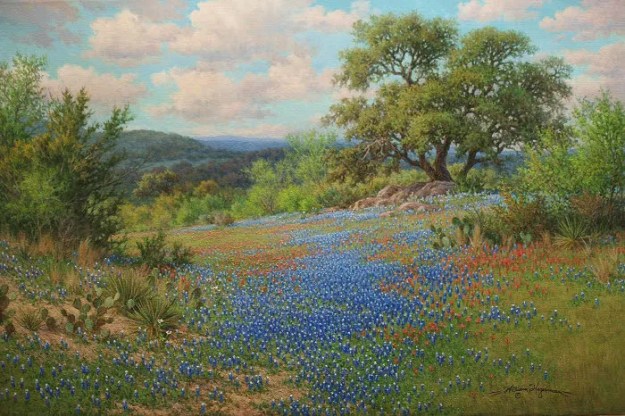
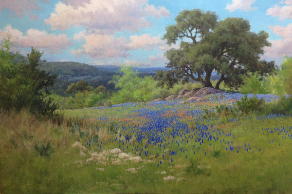
The following painting demonstration will show you some of my thought processes on how changes were made along the way to remove obstacles.  This was a commissioned oil painting for a 24×36 bluebonnet with Indian Paintbrush flowers.

First up is the completed scene of “Interwoven Harmonies,” for reference.

William Hagerman oil painting Texas bluebonnet and Indian Paintbrush

The Journey

The painting’s journey begins as usual with a composition sketch using thinned ultramarine blue paint and a brush. Color is then applied starting with the darker cedar tree for comparison of adjacent areas. My goal before too many details is to cover the canvas as seen in the next photo.

oil painting demo first steps

Now that the canvas was covered I began adding details to the distant hills. First adjustment was to remove the dark cedar next to the oak tree as my eye went straight to it and it wasn’t a very important element.

Next more interest was added to the sky. Further analysis: Space division in the distant hills were too similar and uninteresting, so here the hills were modified.

The green grass (paint) has dried and now the pattern of bluebonnets and red Indian Paintbrush can begin.

bluebonnet oil painting demo

More flowers are added along with a relocation of the rock patch.

More details and more flowers.

oil painting bluebonnet demo

Our cat Hachi, the day before this photo jumped onto my palette and got ultramarine blue and umber on his paws. I told him if he wanted to paint to make himself useful and add in some more bluebonnets for me. I think he’s got some talent. He removed the patchy dirt and took out the yucca type plants on the right. Then he added a patch of dirt around the other cluster of yucca on the left. That was a good idea. However, at this point he told me he no longer wanted to be an artist. Painting bluebonnets was just too much work.

talented cat tired of oil painting

Despite Hachi’s talent he still didn’t address other weak areas. So here I’ve highlighted those stumbling blocks to a viewers journey in the painting.

oil painting demo analysis

Here you will see how some of the issues above were handled. Then I encountered another strange visual of an unintended tangent line that was noticeable from a distance in the bluebonnet patch.

bluebonnet painting demo

Once again here’s the final painting for comparison. You’ll notice that another cloud was added to break the visual line of clouds as well as fixing the tangent line in the bluebonnet patch. Other tweaks were added here and there.

William Hagerman oil painting Texas bluebonnet and Indian Paintbrush

In Conclusion

Painting is about making choices. The end result is you want your viewer to go on the journey through your painting as you intend without tripping them up. Remember, that even if something is there in a reference, you don’t have to put it in. You can add and subtract elements, redesign them to enhance the visual impact of your work. I hope my “self critique” has illustrated that little improvements can make for a bigger visual impact and pleasant journey for your viewers.


Oil Painting Video Demo: Old Barns

In this post I wanted to share with you a short two-minute Oil Painting Video Demo: Old Barns.

Alla Prima or the Direct Method of Painting

In this tutorial, the subject of old tin barns, which were found in New Mexico made a nice subject for this painting demonstration. The direct method or alla prima approach was used in which the entire painting was completed in one session.

Oil Painting Tutorial; Old New Mexico Barns

Thanks for watching!

Oil Painting Composition Critiquing a Critique

In this blog post I decided to talk about oil painting composition, critiquing a critique.

While researching the subject, I came across a respected artist and author who was using works by other artists as examples where composition mistakes had been made. The artist/author then suggested solutions for improvement and did so by modifying the image.

Respectfully, the author did not include the artist’s name to which he was critiquing. However, one example caught my attention.The painting being critiqued was done by an all time favorite master artist named Clark Hulings! I recognized it from a 1999 show catalog that I have.

WHAT’S WRONG WITH THE PAINTING? (Nothing as you will see)

This is the Hulings painting cited as an example whereby a painting composition “rule” was broken.

Clark Hulings Goat Milk Vendor

The so called “rule” was avoiding strong geometric shapes, even if naturally occurring as they can be too distracting.

A strong triangular shape produced by the apparent shadow of a building at the bottom of Hulings painting was the culprit. I agree with the rule to an extent, but everything in a composition is relative to the artist’s vision and even if some supposed rule is broken, yet it serves a legitimate purpose, so be it.

A Composition Improvement? Maybe not

Here’s the modified version suggested by the artist/author which was recreated. The suggested improvement was variegating the shadow, thus breaking up the geometric triangular form.

Is this really an improvement? Here’s my analysis.

Critiquing the Critique

Let’s take a look at the shadow without the chicken along the left side of the triangular shape and the scattered darks near the back edge.

Obviously the shadow overwhelms the painting and your eye drops to it. However, Hulings did two things. First, he added the chicken and broke the line. Secondly, by adding the scattered darks near the edge of the canvas he softened the line and kept your eye from exiting at that point. Obviously, Hulings was aware of the geometric shape.

The goat milk vendor is the obvious focal area. In the so called improvement, the eye now drops and travels in sort of a merry-go-round fashion.

This is not necessarily a bad thing. However, in Hulings original painting the eye stays at the focal area, held in place by the arrow formed by the shadow which lines up and points to the center of action.

It’s true that no artist is free from making mistakes, however, my conclusion is that Hulings was too much of a master painter and in this instance, he deliberately kept the painting as it was to fix your attention on the primary subject.

In Conclusion

The story of the painting is clearly about the goat milk vendor who takes his goat and instead of delivering the milk in bottles, the householder comes and offers a pan and the vendor milks the goat on the spot. How’s that for fresh?

Everything else in the composition is subordinate to the story and the focal area of action. Hulings didn’t make a mistake. He kept that strong shape for a legitimate reason. He used it to make you look where he wanted you to look. So to repeat: Everything in a oil painting composition is relative to the artist’s vision and even if some supposed rule is broken, yet it serves a legitimate purpose, so be it.

Paris France Oil Painting Demo

With this final segment of my Paris France oil painting demo, work is brought to completion. In the previous stage, refinements were made to the focal area.

The next step was to work on the building in the upper right which was still unfinished. Since this building is situated at a different angle to the light, it is kept cooler. Brush work is also minimized with sharper detail towards my clients wife in the window. The sharpness of contrast leads your eye to that area.

paris france oil painting demo detail by Byron

Moving On

Now that the primary buildings are mostly done, it’s time to move on to the building on the left. The goal for this section is to keep it more painterly and less detailed. This building brings balance to the heaviness of the composition on the right side, however it should not compete. Therefore, detail was minimized for the same reason as the upper section of the building on the right. Also, the building is in shadow, so all colors are kept to the cool side and kept to a darker value.

After this the next major element to be painted was the Eifel Tower. Enough detail was added to mimic the “texture” of the tower without rendering tight detail which kept it in the distance. Colors are kept subdued and within the overall color scheme. Keeping in mind, the tower although an important element is not the primary subject, but my client’s wife in the window.

Paris France oil painting demo

Painting the Sky

After letting the painting dry, it’s time to go and finish the sky. More intensity of color is added and is applied with thicker paint and bolder brush work. More details and brush work are now added into the distance trees. The lone figure in the distance is painted in as well as the two gentlemen on the left engaged in conversation. A perspective bobble on a vertical line is corrected on the left building. I have so much valued the T-square in this painting!

The street is now repainted to represent the darker brick pavement. To make the street recede colors are kept cooler in the distance and warmer in the front. The basic mix was ultramarine blue and cadmium red medium towards the front with more cooler and lighter violet tones in the distance.

oil painting demo of Paris

THE LAST STAGE of the Paris France Oil Painting Demo

Finally the last of the main elements being the Citroen car and the male figure on the sidewalk are painted in. More detail (subtle highlights) to mimic the texture of the brick street is also added.

A final refinement is bringing a veil of color onto the lower half of the middle building and some added highlights in a few spots. The darkening veil represents a long shadow from the trees in relation to the angle of light. And the few subtle highlights sets up an implied diagonal line from the light source pointing in a downward angle towards the primary subject of my client’s wife the star of the painting!

Oil Painting of a Paris Street scene with Eifell Tower by Byron

Here are a few details. Click the image for a larger view.

oil painting demo of paris france detail

oil painting demo Eifell Tower, paris street scene detail

I hope you’ve enjoyed following along with this Paris France Oil Painting Demo and commissioned painting. If you would like to learn more about commissioned work, please see the following page. COMMISSIONS

A happy customer!

customer of commissioned oil painting by William Byron Hagerman


Color Mixing Workshop

Mixing colors are a challenge for most art students. Therefore,  I recently conducted a one day color mixing workshop. Through a series of exercises, attendees were able to get a clearer understanding of how to analyze and mix paint by doing specific color charts.

Preprinted color charts or those done by others are really of little value. To learn to mix colors, YOU must do the work. Learning comes from the doing, not solely by viewing the end result.

Choosing the colors

The color palette of choice for doing the exercises in the color mixing workshop are listed in the following blog post.

Here’s a short video of the class. It’s also my first attempt at making a video. 🙂 Hope you enjoy it!

Color Mixing Workshop Video