Tag Archives: art tips

How to Draw an Oak Tree Video

In this post I’d like to share with you, how to draw an oak tree video. When taking painting lessons, many years ago, the instructor shared an approach which has been of great value not only to myself, but to other art students in drawing trees. I’m now sharing this beneficial art tip.

How to Draw an Oak Tree Video online art lesson by William Hagerman artist

Seeing Shape and Form in Drawing an Oak Tree

A tree is recognized by its shape or silhouette. What gives a shape it’s dimension is through the use of light and dark values, which describe the form of the shape. This video will show you how to use an HB, 3B and 6B graphite pencil to compose a convincing tree form. In this instance a personal favorite. The mighty live oak!

Hope you enjoyed this How to Draw an Oak Tree Video!

You might also like this blog post on How to Paint a Tree. If interested in joining my Zoom art class, please contact me.

Here is the Video Transcript on How to Draw an Oak Tree

Note: The transcript sounds a little weird if you don’t watch the video. 🙂

Hello. William Hagerman here, I’m going to share with you a little bit of a tip that I learned many years ago from my own art instructor about drawing trees, some things that helped me be able to compose.

I have laid out here my HB pencil, a 3B and a 6B hard graphite pencil. This represents what will be three different values. The harder the lead, the lighter the stroke appears, the softer the lead, the darker the marks will be. You could use one pencil and just through pressure and make a darker accent. But I thought I would work with these. What I learned here, this is my HB pencil is trying to design, say, an Oak tree with sort of a block, almost circular type form. For example, started doing some things like this.

Hopefully you can be able to see that. I’ll be darkening things up. But what this helps to do is I can kind of visualize areas that will sort of overlap certain areas and help me to try and draw in some sort of a silhouette here, of a larger Oak tree. So starting with, say, source of light coming in from this direction, we have this one sort of rounded, oval type of a form, and it’s going to graduate from light to dark. So I’m starting with the lighter HB pencil, using the side here, got it sharpened up, so you have a little bit of a longer lead there. And I want to come down just a little ways, and then I want to pick up the 3B pencil, which is a little bit darker. And again, it graduates from a light to middle into a dark value. So I’m going to go in here, keeping in mind the direction of where the sunlight is coming from to the side there on the left.

And then a 6B pencil, which has a darker mark, I’m going to indicate areas underneath here that represent more of the deeper parts of the tree, the shadow. And here it meets another form that’s sort of in front of it. Excuse me, just hit the camera. Sorry about that. I’m going to go back to the HB. It’s going to repeat the process again, lights coming from here, and we’re going to have sort of the lighter tone. I could probably erase that little line there but I’m not going to worry about it right now. This is not to be a finished drawing, but something to help you visualize the structure of some trees. Okay, so there’s the light. Pick up next the three B hardness graphite pencil.

And each of these kind of represent some little forms of smaller ones in the big area, kind of light, dark, like dark, and then into the deeper parts of the tree, then oops there goes the lead, pressed a little too hard. That’s okay.

Re-darkening some of this to get a little greater contrast. Now then going back again to the HB to start the process over again. Each of these clumps are going to get the same sort of process of a light, a middle value, and then a dark value.

Do this one as well, if you notice, keeping in mind the direction of the light is coming from here. So it’s catching light. But as it comes down and underneath, some of this might be getting a little darker. Again, some of the deepest part within the shadow.

Okay. So now we have a couple of areas, we can maybe divide this one larger shape, this one kind of overlaps. But I want to take this one here and this one maybe pull it down a little bit. Okay. Repeat the process,  get the right pencil here, my lighter one, HB.

Then we’re going to go darker.

Switch to the darkest graphite pencil there.

Now then, this one here is sort of more because I have this one overlapping. It’s sort of sitting more up underneath all of this. So it’s not out to the front, it’s more to the back. And as a result of the lights coming from here, these clumps of foliage are going to cast its own shadow across this. So this is going to be mostly dark. So this is kind of like on the backside of the tree.

There may be a little bit of light catching through, kind of a middle value there, but for the most part, that’s on the back side of that tree. So that’s why it’s a little darker overall. Now, this is going to be another clump. I may change its direction a little bit. I say you can alter it as you go along, but again, you’re going to have the this one is sticking out a little bit in front, so we’ll have some light on it.

This one then go into the darker area. And again, because this is curving back and it’s kind of away from the light, see, it’s going to be darker. And underneath, again, we’re going to have the darker foliage.

This is a clump that’s kind of sitting off in the back. And because of all of these, it too is going to be mostly dark. So it’s not going to get the lighter, but it will get a little reflective light from the sky. So I will use the 3B pencil here, kind of represent a little lighter edge up against the sky. But for the most part, it’s all going to be in shadow. This clump here is going to be also perhaps on the back side. So it’s going to also receive some more dark, maybe quite a bit of dark under here because all this other foliage is casting a shadow.

Okay. So here I have the basic structure of tree. We can then go back in and imagine maybe some limbs, the trunk, wrap, some limbs that’s going to come down, fall down. More details, since it’s going up into the dark of the tree, the tree trunks also have to be dark because I say there’s not light, it’s more overhead. So most of the tree trunk is going to be dark because it’s underneath. Indication of some little limbs coming through, and just give a little ground line.

As you see this gives you kind of an idea of light middle, dark. It describes more of the form of the tree. Now as you go if you were painting this then you would mix up three different values of a light, middle and a dark value. So that would help you I think in being able to achieve more realism into your tree getting more shape and form so it doesn’t look flat. So I hope this little tip that helped me in visualizing many years ago from my artist you’re working with these little blocked clumps and having some overlap one another you can more easily visualize what’s in the front, what’s on the backside and it’ll help you understand your light and darks where they would possibly go.

Chasing Color and Capturing It

Chasing color and capturing it has in many ways been elusive for many trying to paint. Further it’s been a course of intense study for a very long time including the artistic and science side to it with many opinions. Recently, I came across an old book published in 1895 or so, that was written for teachers on color study. My how the English language has changed since then! Despite the wordiness, it got me to thinking on the subject of color once again and thought I’d share some insights gained from 41 years of painting.

Color is Personal

Color perception and taste is personal. No two people likely see colors in the same way and artists have their favorite paints and often no two have the same exact palette. Color preference is seen in other areas. As an example, take shopping for a neck tie. Pick any tie and someone will love the colors in it, while another wouldn’t want to be caught dead wearing it. Yes, color is personal. Likely you can harmonize your tastes in clothing and its accessories and even in your home furnishings and decor. So it goes with painting. Artist’s works can often be recognized by their use of color, not just technique or subject matter. Someone may like the color scheme chosen, while others hate it. That’s how it is. What’s important for an artist regardless of preference is simply to learn to mix and duplicate the appearance of colors they see and then put them in the right place in their painting.

We really don’t need to know the science of how we see color. Be happy that you can, even if your vision isn’t the same as others. It brings variety, but you can develop your color sense to a higher degree through practice and careful observation.

Paints to Mix By

First you need a set of colors that will give you a good vivid representation of the 12 hues on a color wheel. For that I list the following as primary colors.

  • Yellow: Cadmium Yellow Light or Pale
  • Blue: Phthalo Blue or Winsor Blue
  • Red: Permanent Rose or Quinacridone Rose

These colors differ from what one normally considers as primary colors because those do not produce a full spectrum. The above colors are similar to the hues of printing inks of yellow, cyan and magenta. Although these produce a fairly vivid color wheel when mixed, we need to remember these are not inks being printed which are made up of little dots and visually combined to see a color. Therefore, I prefer to have tubed colors that approximate the secondary colors.

  • Orange: Cadmium Orange
  • Violet: Dioxazine Violet or Winsor Violet
  • Green: Permanent Green ( This can be found in Winsor Newton Brand )

Using a tubed color instead of mixing a secondary color will give a more intense color and it will also give more intense intermediate colors when mixed with the primary colors. To lower the brightness of a color, instead of using its compliment you can mix a gray of roughly half black and half raw umber. To tint the color add white. For further explanations you may wish to read my other article on how to choose a color palette. Hope these suggestions will help in chasing color and capturing it.

Speaking of Color

Here’s a variety of paintings up for auction on eBay featuring different color schemes.

colorful impressionist landscape oil painting water reflections by artist William Byron Hagerman

Morning Light at the Pond 10×8 oil by Byron

To have a chance at placing a winning bid, first sign into your eBay account and then visit my profile page. You’ll see what other paintings are also available. Auction end dates are variable.

Another way to find my listings while logged in, is using eBay’s search feature and typing in “Nature landscape oil painting” in parenthesis and it will likely return results for my work.


impressionist landscape oil painting autumn mountain stream by artist William Byron Hagerman

Colorful Creek 8×10 oil by Byron


Landscape oil painting autumn trees by William Byron Hagerman

Color in the Canyon


landscape oil painting Arizona mountain vista by artist William Byron Hagerman

Arizona Vista 8×10 oil by Byron


Thanks for reading!


Plein Air Painting Benefits

A New Plein Air Painting

I was recently able to experience the plein air painting benefits when coming upon an old red barn in a field full of red clover flowers. It simply could not be passed up. Below you can see my pochade box for plein air (out of doors) painting and my subject matter behind.

plein air painting with red barn and red clover

Plein air painting pochade box and view of scene


Red Barn and field of Red Clover plein air oil painting by William "Byron" Hagerman

Red Barn and Red Clover 8×10 oil by Byron

This painting with its easy title (Red Barn and Red Clover) will also be up for auction on eBay. It’ll end May 7th. You can access the auction from my profile page.

Bidding started at only .99 cents!


Benefits of Plein Air Painting

So what are the benefits of painting out of doors, versus working from a photo? Simply put, photos lie compared to what your own eyes can see. Camera’s are a distortion of reality. Although I find it essential in recording details and the fact it’s not always possible or practical to paint at some locations. However, painting from life increases your understanding of color, light and values more so than anything else. You also become aware of a camera’s limitations and how to work work with those limitations.

But, what if you don’t have the desire or it’s not practical to paint on location? Try taking just your paints, and mixing the colors you see and make notes in a journal. Sort of a color chart. Of course take a photo to remind you of your scene or do a pencil sketch… or both. So get out and give it a try! It’ll lend authenticity to your work.

If you need plein air painting supplies, here’s a link to Judson’s Art Outfitters. I purchased the 9×12 Guerilla Box years ago and it’s still going strong.

Other Recent Byron Signature Paintings

Landscape bluebonnet painting wtih oak tree and old house by William Byron Hagerman

Nostalgic Bluebonnets 8×10 oil by Byron copyright 2019


I was feeling a little bit nostalgic for a classic view of one of my favorite flowers to include in my landscape paintings. (Bluebonnets!)


oil painting of white dogwood tree and wisteria by William " Byron" Hagerman

Days of Spring 8×10 oil painting by Byron copyright 2019


Now living in North East Texas, it’s been enjoyable to see a variety of trees and flowers not previously encountered.  In several areas there were flowering Dogwood and wisteria growing up along fences and even up into the trees. Not to mention fields and fields of yellow flowers. So I decided to combine all three. Hope you enjoy these latest 3 Byron paintings!

How to Improve Your Paintings

Learning how to improve your paintings, often boils down to experience in learning to self critique your work as you work.

Improve your paintings with the right mind-set

To have the right mind-set, think of your painting as a journey in which you want to lead your viewer through your painting without tripping along the path. In other words remove obstacles that could lead in the wrong direction or cause them to stop and stumble.

oil painting demo with a self critique

The following painting demonstration will show you some of my thought processes on how changes were made along the way to remove obstacles.  This was a commissioned oil painting for a 24×36 bluebonnet with Indian Paintbrush flowers.

First up is the completed scene of “Interwoven Harmonies,” for reference.

William Hagerman oil painting Texas bluebonnet and Indian Paintbrush

The Journey

The painting’s journey begins as usual with a composition sketch using thinned ultramarine blue paint and a brush. Color is then applied starting with the darker cedar tree for comparison of adjacent areas. My goal before too many details is to cover the canvas as seen in the next photo.

oil painting demo first steps

Now that the canvas was covered I began adding details to the distant hills. First adjustment was to remove the dark cedar next to the oak tree as my eye went straight to it and it wasn’t a very important element.

Next more interest was added to the sky. Further analysis: Space division in the distant hills were too similar and uninteresting, so here the hills were modified.

The green grass (paint) has dried and now the pattern of bluebonnets and red Indian Paintbrush can begin.

bluebonnet oil painting demo

More flowers are added along with a relocation of the rock patch.

More details and more flowers.

oil painting bluebonnet demo

Our cat Hachi, the day before this photo jumped onto my palette and got ultramarine blue and umber on his paws. I told him if he wanted to paint to make himself useful and add in some more bluebonnets for me. I think he’s got some talent. He removed the patchy dirt and took out the yucca type plants on the right. Then he added a patch of dirt around the other cluster of yucca on the left. That was a good idea. However, at this point he told me he no longer wanted to be an artist. Painting bluebonnets was just too much work.

talented cat tired of oil painting

Despite Hachi’s talent he still didn’t address other weak areas. So here I’ve highlighted those stumbling blocks to a viewers journey in the painting.

oil painting demo analysis

Here you will see how some of the issues above were handled. Then I encountered another strange visual of an unintended tangent line that was noticeable from a distance in the bluebonnet patch.

bluebonnet painting demo

Once again here’s the final painting for comparison. You’ll notice that another cloud was added to break the visual line of clouds as well as fixing the tangent line in the bluebonnet patch. Other tweaks were added here and there.

William Hagerman oil painting Texas bluebonnet and Indian Paintbrush

In Conclusion

Painting is about making choices. The end result is you want your viewer to go on the journey through your painting as you intend without tripping them up. Remember, that even if something is there in a reference, you don’t have to put it in. You can add and subtract elements, redesign them to enhance the visual impact of your work. I hope my “self critique” has illustrated that little improvements can make for a bigger visual impact and pleasant journey for your viewers.


What makes artwork original?

Making Artwork Original

A question was recently posed on the use of photo references in artwork and to further describe what makes artwork original? The questions were…

  • If I painted from other people’s reference photos, is my work considered original?
  • If I’m working with my own reference photos, do you care if they were taken in a photo workshop?

artist at workSo what makes artwork original? My reply, although not intended to be legal advice on copyright issues, perhaps will give food for thought.

Most artists use reference material, even having files of clippings from magazines and other sources. These include, electronic images, paper as well as their own photos, sketches etc. Artists use these as tools for inspiration and designing their art. Part of the issue is the extent to which a reference is used (originality) when it comes from someone else (copyright issues) and whether you have the right to use the images.

The first issue is when painting from other peoples reference photos. A photo like art is protected by copyright. If you’ve been given the OK to use them without restriction, then of course you can use them. If you’ve copied the photo verbatim, in a painting, the originality would be questioned. After all it was still another persons vision. But, if you’ve only used it as a reference to incorporate into your own composition then you’re using your artistic talents to compose a scene and not someone else. Thus, it’s an original.

Using your own photos

If you take your own reference photos even in a workshop setting, YOU still took those photos, so you have the right to use them unless there was some restrictions as part of the workshop on their use outside of the workshop, but other than that they’re still original.

However, there can be exceptions, but not in regards to originality. If you’re painting from a human model and you paint them in such a way that they would be recognizable. There could be the question of having a model release giving you the right to use that persons image. I was in a workshop that had a cowboy model and I took my own photos. If I painted him in the future in such a way as to make him identifiable, I might wonder whether or not another model release was needed. There was an art show in connection with this workshop and the painting of him that I did sold. So there may have already been a general model release as part of the workshop.

In my opinion if you have the right to use a reference photo taken by someone else, but have copied it as is, then I would question originality even if you had the legal right to use the photo. It was another persons vision.

If you’ve taken the photos then that’s you’re vision. Just as along as you’re not infringing upon another persons rights or trademarked images.

I hope this gives some clarity.

How to Choose a Color Palette

When it comes to painting, no two artists seem to agree on how to choose a color palette. After all, painting is subjective as it reflects the temperament of the artist and his or her own color sense. A student or newcomer to painting is often left scratching their head as to what colors are best. It’s then compounded by so many choices as to brands of paint. This post hopefully will adequately address both issues.

how to choose a color palette

COLOR SELECTION

When choosing a palette it should be capable of producing vivid mixtures of all 12 hues on the color wheel.
Basic color theory states that the 3 primaries of yellow, red and blue when intermixed will produce all other colors. Then along with white and black to produce tints and shades of those color is all that’s needed. In reality that’s not the case. What we often think of as being a primary yellow, red and blue from our childhood school days will not produce all the hues on a color wheel to their full spectrum of intensity.

A BETTER CHOICE ON HOW TO CHOOSE A COLOR PALETTE

In printing, inks used to reproduce a color image are yellow, cyan and magenta. Just like your printer at home. Paints closely matching this would be Cadmium Yellow Light or Pale, Permanent Rose or Quinacridone Rose and Phthalo Blue. The intensity of the secondary colors when mixing any two of these primary colors is much improved.

So are these 3 colors enough to produce a full spectrum range? Not really. It can further be improved by adding a purchased premixed color corresponding to one of the secondary colors in the green, violet and orange range. Which ones? The colors of choice are: Cadmium Orange (for Orange), Winsor Newton Permanent Green (for Green) and Dioxazine Purple. (for Violet)  Adding Titanium White and either Ivory or Oxide black and you have a basic set of 6 colors plus white and black.

To get the most intensity, mix your primary with one of these tubed colors to get your remaining intermediate colors which are often referred to as tertiary colors. In the tests that I have done in mixing I found this set up to give a very intense range of spectrum hues. To lower the intensities of these bright colors, you can add its compliment or add a gray from a mixture of approximately half Ivory Black and half Raw Umber. This gray can be added to lower the intensities for most colors except for yellow and yellow orange. Why? The resulting mixture has a green cast. To over come this I mix one other gray for those colors. I use the Black/Umber mix and then add Permanent Rose until it takes on a hue of a dark violet. This will dull the yellow and yellow orange without it shifting green thus keeping it in the right color family.

The List of Basics

  • Cadmium Yellow Light or Pale (yellow)
  • Permanent Rose or Quinacridone Rose (red)
  • Phthalo Blue (Blue)
  • Cadmium Orange (Orange)
  • Dioxazine Purple (Violet)
  • Winsor & Newton Permanent Green (Green)
  • Titanium White
  • Ivory or Oxide Black
  • Raw Umber or Burnt Umber (if you plan to use it with black to make a gray to modify color intensities)

Likely you will not be painting with such vivid colors. To dull the intensity you mix their compliments. In theory those colors are opposite on the color wheel. Sometimes when working with these pigments a compliment that is not directly across may produce a more pleasing result. This is where actually taking your paint and mixing colors is beneficial. If you were a hair stylist you couldn’t call yourself one if you never cut hair. You can’t rely on the work of others. You have to do the work yourself. Mix your own colors. Learn how they interact as you mix. Stop relying on all those printed color wheels and charts. Make your own.

In time, you can add other colors to this basic set. I like having a variety such as the various earth tones in the dull orange and brown ranges such as Burnt Sienna or Transparent Oxide Red and Burnt Umber. Some colors have unique pigments and the way they behave in a mixture can’t be duplicated with this basic set. So having some optional colors expands your color range. In time you will find which colors fit your own aesthetics.

Brands of Paint

Just as deciding on which colors to buy, choosing within what brands can also be daunting from the amount of choices. In my opinion, buy the best you can afford. Price is a pretty good indicator as to quality. Good paints produce better color mixtures. I enjoy some colors in one brand as opposed to the same in another.

In the following link a rather extensive review is given regarding many of the popular brands of paint with pros and cons. I agree (for the most part) with statements on this site. Again it boils down to a personal choice. I hope this will give you a good starting point when it comes to choosing your palette of colors and the available brands of paint that are out there. Happy color mixing!

Benefits of Painting a Still Life

You’re the Conductor!

What are the benefits of painting a still life? This question came back to mind while preparing paintings for my exhibit at the Winnsboro Art & Wine Festival. The show wouldn’t be complete without having a painting or two featuring the fruit of the vine (grapes) which I show here done by my alter ego Byron. A nice departure from my landscapes. There are several benefits of painting a still life and right off the bat you get to be the conductor of your painting!

still life oil painting with grapes vase candle by Byron

My Little Vase 12×9 oil by Byron copyright 2016

Unlike landscapes you get to have total control over the lighting, color harmony and the subject matter. For landscapes you’re at the mercy of the weather. Many times I’ve wished for sunlight but instead overcast skies with no sign of them leaving anytime soon. Or hoping for brilliant fall foliage only to get dull shades of burnt orange or worse, no leaves on the trees! That brings us to another benefit: Timing!

No Timing Constraints; More Benefits of Painting a Still Life

Another advantage of painting a still life is that there are no time constraints. Unless of course you’re on a deadline to complete a painting or if you’re painting flowers and they’ve started to wilt or the fruit is starting to rot then that’s yucky. In which case you might be painting a little too slow. But, aside from those an artist can orchestrate a simple or complex composition as he or she wishes and study the scene at leisure with all it’s intricacies of color, light and shadow as it describes the various forms.

Since the scene is set and unmovable an artist will have ample time to work on drawing from life, which is an invaluable skill as opposed to seeing a flat image (photo) and drawing from it.

Still life paintings are also beneficial in that the objects form is more readily discernible. These forms are often oval, rectangular, cylindrical, cone shaped or combinations. These same geometric forms underlie objects in the landscape. If you learn to properly shade these forms in a still life with a single source of light, you will better understand how to shade other objects whose structure incorporates these various forms in the landscape.

still life oil painting with raku vase grapes orange by Byron

Raku Vase 9×12 oil by Byron copyright 2016

Communicating a Theme

Another benefit of painting a still life, is being able to communicate a story. But, does that mean that all the objects have to relate to one another? If you wish for a rustic theme, does it mean you have to leave out something elegant or vice versa? No! As long as the theme visually harmonizes and creates interest.  As an example here is a frame style combination that is both rustic and elegant. So they can work together, just as in a still life!

frame corner style of rustic and elegance

Rustic and Elegant frame style

The benefits of painting a still life are valuable both to the newbie artist and a good reminder to someone like me who hasn’t tried their hand at a still life in sometime. I have to say it was a lot of fun! Plus, I was able to render each of these still life paintings in one alla prima painting session. (All at once) Perhaps one day I will do a William Hagerman signature still life painting!

Would love to hear your thoughts about my still life work? As the Winnsboro show approaches I’ll be posting more of the art to be in the exhibit. Thanks for reading!

One last reminder before I go, is my latest eBay auction work going on now until 6PM Pacific Time on Tuesday October 18th. Fall is in the air in this mountain setting. Inspired by a trip near Trinidad, Colorado.

The Call of Autumn 9x12 oil by Byron for eBay auction

The Call of Autumn 9×12 oil by Byron for eBay auction

You can access the auction from my eBay profile page.


How to Paint Bluebonnets

How to paint bluebonnets is the the focus here in part 4 of my oil painting demo series of posts on painting a Texas bluebonnet landscape.

First, I want to show the completed painting. This will give you an idea of where the painting is going. Click on the image for a larger view.

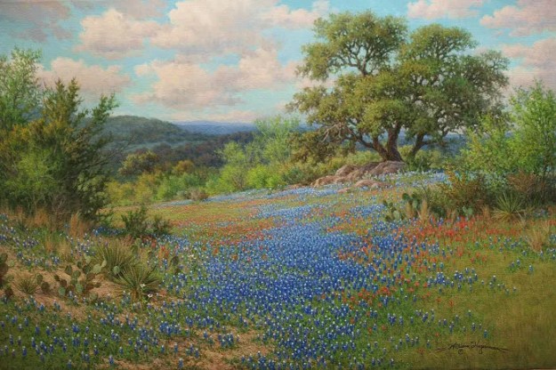
bluebonnet oil painting by William "Byron" Hagerman

I set the stage for the bluebonnets by putting in the grasses working from back to front. I darken the values as I come forward.

part4_1sml

Next I work to cover the rest of the canvas. I’m not focusing heavily on details at this point, just getting my under-painting done. For some of the textures of the grasses I like to use an old jagged edged bristle fan brush.

part4_2sml

After the paint dries I then move on to massing in the bluebonnets with a dark value of blue based off of Ultramarine. I departed somewhat in my traditional mixture by adding Indanthrene Blue by Winsor & Newton into the mix. Since bluebonnets lean towards blue violet I also add in some Dioxine Purple or add Permanent Rose or Alizarin for variety.

part4_3sml

I continue with my dark mix for the bluebonnets, working out a pattern that leads the eye back into the painting.

part4_4sml

After this layer dries I start adding lighter values for the bluebonnets working from the back to front.

part4_5sml

Here’s a detail of the bluebonnets.

how to paint bluebonnets

Another up close view of the painted bluebonnets.

part4_7sml

Once I finished all the bluebonnets I proceeded to other areas of the painting that needed the finish work such as the big tree, rocks, and cactus and a little bit of cutting back into the bluebonnets here and there with the grass color. I wanted to make sure they didn’t look as though they were floating and make the pattern more pleasing and believable.

The following are up close sections so you can see more of the finished detail. As you can see I’ve kept tight detail to a minimum. However, due to the size of the painting it looks more detailed than it really is. I first finish the pattern of the foliage with light dark and middle values. Then I add tree limbs. When dry I negative shape paint the sky holes, chiseling out the forms of limbs and further modifying the shape of the tree.

part5_oaktreedetail_sml

Another patch of completed bluebonnets and surrounding vegetation and rocks.

part5_bluebonnetdetail_sml

Detail of the middle ground cactus.

part5_cactusdetail_sml

Here’s the cactus in the foreground. Here you can see some individual bluebonnets scattered around although not haphazardly. I’m keeping my design in mind. These bluebonnets are a supportive role to the larger masses. Again on the topic of how to paint bluebonnets, notice how the bluebonnets have a dark value, followed by a lighter value and finally a white cap on top. It gives the flowers depth. Also some of the cactus stickers are hinted at. However, in the above image I have not added them except for a few catching the light. Why? They’re further away and your eye would not pick up that kind of detail. Plus the amount of detail has to be in proportion to the rest of the details in the painting. In other words, if your painting is more impressionistic would it make sense to add a bunch of tight detail on an object and leave the rest loosely painted. This might work on a close up view and keeping a background simple, but remember to keep your overall painting in mind and don’t get caught up in rendering details and loose focus on the whole. Every section has to relate to the other.

part5_foregroundcactus_sml

Below is a detail section of rocks. Remember a rock is a shape. It has sides and how the rock is positioned in relation to the light you will have different values. If only two sides are visible you will have a a light and shadow area. The same is true if you can see three sides, but you will have three values at a minimum. Light, mid value and shadow.  Don’t put your sunlight colors in areas that are to be in shadow or put shadow colors in areas that are in the light. Colors in the light are warmer, those in shadow are cooler, but sometimes they can appear somewhat warmer due to a warm reflected light bouncing off other warm colored rocks in sunshine. You learn to paint rocks by studying them. No good substitute for observing them and paying attention to how the light describes their form.

part5_rockdetail_sml

Here’s the detail area of the tree on the left and a view of the distant hills and lower sky. In painting the tree the sequence is establish the foliage first, them indicate limb structure and finally paint in the negative shapes on the sides of the limbs and other sky holes keeping in mind what’s in behind the tree. Often you will have to paint those values a little darker since they can appear to be stuck on top of the tree instead of being behind it. You can also modify the sky hole a little by overlapping it with some tree foliage.

part5_treehilldetail_sml

And finally here’s another close up view of the clouds in the right hand corner area. Again like any other shape a cloud has form to it and as such is subject to having light and shadow sides. Best way to learn to paint clouds is by actually studying them.

part5_clouddetail_sml

I hope that these series of posts will benefit you in your own painting.  Have fun learning!


Finding Artistic Inspiration

Whether one is an artist or not, sometimes we just feel uninspired and our creative side feels drained. There’s an abundance of ideas out there in combating this issue of finding artistic inspiration, but lacking any specific health issue’s that may contribute I wanted to focus on one solution to get your creative energy flowing again. What is that?

unplugged

In today’s world people are plugged in to their electronic media at work and leisure time and elsewhere and sometimes dangerously so. Although electronics like being plugged in, because they draw power which they need, humans don’t recharge that way. For the creative side it drains us of our creative energy. In my artist’s statement I have said when we experience the outdoors, we feel drawn to it, nurtured by it. Being outdoors to enjoy the beauty of nature does have a recharging effect. Studies are showing that disconnecting from our devices and getting outside in nature have shown improvements in creative tasks as opposed to those who were not.

There is so much intricate design in nature that it can’t help but stir creativity when you slow down enough to take a little of it in.

Recently we have been doing some yard work. Even in this confined area of a backyard I started to notice the possibility for a couple of small paintings. A subject that I had not really considered and that of painting flowers in an almost still life setting.  Here below are two small paintings showing how just being outside in my own backyard inspired these two paintings. Not that our backyard looks like this, but what flowers we did have was enough to inspire a little creativity and a departure from my regular subject matter.

Corner Garden

Corner Garden 6×6 oil painting by Byron copyright 2015

The Back Gate

The Back Gate 6×6 oil painting by Byron copyright 2015

So the next time you feel a little run down, try unplugging and get outdoors and start feeling the creative energy returning. Even if it’s in your own backyard! If you don’t have a backyard, try a local park. Look at the trees, the sky, flowers, whatever and let it rejuvenate you.

These two “backyard” nature inspired paintings were recently sold on my eBay auctions as were the nature inspired ones below!

Barn and Hay Bales

Barn and Hay Bales 6×6 oil by Byron copyright 2015

I enjoyed painting this little scene of a little barn with a row of honeysuckle growing in front and some round hay bales. Not sure what the name of the purple flowers were.

blooming_yucca_sml

Dos Yucca 6×6 oil by Byron copyright 2015

I liked the contrast of the yucca up against the dark of the tree behind them.

River Elegance Plein Air

Guadalupe River (River Elegance) plein air 8×10 acrylic and oil painting by William Hagerman revised copyright 2015

This was painted directly from life on location in the Texas Hill Country near Boerne, TX along the Guadalupe River. It had remained in my collection for some time, but is now in its new home.

You can access the auctions from my profile page. Any offerings will be displayed here.

Remember, bidding starts at a penny! Have a great day.


How to Package an Oil Painting

brushes

If you sell your painting to an out-of-state buyer, chances are you’ll need to send the artwork by courier. Of course, this raises practical concerns. What is the best way to package an oil painting? Oil paintings are more susceptible to damage, especially if there are thick areas of the canvas covered with multiple layers of paint.

For this reason, we do not recommend rolling up your oil painting to send in a tube. This is OK for a poster or photographic print but taking an oil painting off its stretcher and rolling it increases the risk of damage. Oil paintings take a long time to dry and are more susceptible to damage from light, heat, humidity, dust and dirt. It’s just not worth risking damage to shave shipping costs, it’s a false economy. If you are on a budget it is best to send the item Economy or use a competitively priced courier service. Choose a professional courier, checking feedback scores and customer reviews as well as prices.

Points to Consider
Will you be sending a framed or unframed canvas? Finding the right balance can be tricky. You want to protect your painting without bulking up its weight.

As an oil painter, your top goal is to ensure your canvas does not get punctured. If your painting is worth a lot, you might want to take the work to a specialist packaging company that custom makes and builds crates for high-value artwork.

1

For the purpose of this post, here is a handy and quick guide on how to package an oil painting for shipping. Keep in mind this is a general, illustrative guide to packaging. The advice can be used for larger works scaling up to accommodate large oil paintings.

Materials Required:

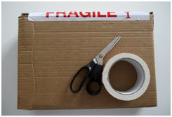
  • Scissors or Stanley Knife( utility knife)
  • Packaging Tape
  • Heavy Duty Black Refuse/Garbage Bags
  • Foam Board
  • Foam sheet
  • Triple-ply cardboard

2

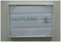
Wrap the Canvas in a Light Layer of Foam
Wrapping your canvas in a light layer of foam, will protect the painting from getting scratched or nicked during transit. Do not use too much foam as the corner protectors will not sit nicely on the edge of the frame. Tape the frame neatly in place as if you were wrapping a delicate gift.

3

Protect the Corners
Extra protection is always a good idea. Most packaging companies offer a range of corner protectors in plastic, foam or cardboard. With unframed oil canvases, it is best if you invest in foam edge and corner protectors. The foam protectors should fit snugly, but not too tightly. If your work is framed, you can use plastic or cardboard protectors. However, these will need to be placed on the frame first before wrapping it in a light layer of foam.

4

Seal from Moisture & Dust
Now that you’ve carefully wrapped your canvas in a light layer of foam and used the corner protectors, it’s time to seal the artwork from moisture and dust with plastic or a heavy duty black refuse/garbage bag. If the bag is significantly bigger than the frame, use a pair of scissors to trim the excess material.

5

Insulate the Canvas
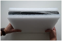
To insulate the canvas you will need insulating foam. It may be difficult to locate insulating foam large enough to accommodate the size of your artwork. If so you may need to use multiple boards, carefully tapping them together to form a sandwich. If your artwork is on the smaller side, you will need to cut out two slabs of insulating foam. Trace the form of the artwork with your Stanley knife to cut out two artwork sized slabs of foam. Use each slab to sandwich the frame.

6

Now, tape the slabs in place as show in the photo. If you cannot access foam slabs, two to three layers of bubble wrap will be a sufficient replacement.


Customs Documents & Shipping Labels
When booking your courier service, most companies provide customs and shipping labels at time of booking. Of course, customs documents will not be necessary if you are sending from one US state to another state. However, if you are shipping abroad, you will need to double check any shipping restrictions for the recipient country. Most companies will auto generate custom forms and labels at time of booking. All you need to do is print these documents out and attach them to your package. It’s recommended if you are shipping abroad to include a duplicate copy inside the box.

7

Box the Artwork
Most packaging companies will wrap artwork with triple-ply cardboard for a custom fit. This also saves using parcel chips and bulking up the package. It’s fairly obvious the bulkier a package is the more you will have to pay to send it. You can achieve a custom fit with cardboard from a flattened box or a purchased sheet of cardboard.

8

Wrapping the artwork is similar to wrapping a boxed gift, just with thicker materials. Score each side of the package, cutting in the corners, so the flaps can be gently folded and taped into place. Fold the flaps around the frame, and tape to secure.

9

Seal the Artwork
Now, that you’ve wrapped the artwork and taped the cardboard in place; it’s time to seal it. Don’t worry if your package isn’t picture perfect. This isn’t an aesthetic exercise. It’s just needs to be secure, so you’ll need to seal the edges at least twice all the way round as show in the photo above.

Attach Labels and Documents
If there is any wording or bar-codes on the box, these will need to be removed, concealed or blacked out with a marker. This will avoid delays when the courier comes to collect. Attach all labels and custom documents carefully to the parcel.

While you may be tempted to roll your painting to save money, it’s not the best way to send oil paintings. You’ve spent hours perfecting your canvas, so why not use the very best packaging materials to safeguard your masterpiece? Your clients will thank you in the end.

This article was written by guest writer Heshaam Hague with Fastlane International, a comprehensive parcel delivery service company that specializes in sending small, large or heavy parcels by economy or express delivery to and from any country in the world.

Â