Tag Archives: oil painting demo

Hagerman Oil Painting Video

Hello there!

Well, I thought I’d share a short oil painting video that I created. Originally it was for Instagram, (@hagermanart) so it’s less than a minute. It shows the general order in which I work, whether it’s under my Byron Signature or William Hagerman Signature works.

Hope you enjoy it. This little painting is also up for auction on eBay ending Saturday June 26, 2021. Direct Link to auction.

Hagerman Oil Painting Video

How to Improve Your Paintings

Learning how to improve your paintings, often boils down to experience in learning to self critique your work as you work.

Improve your paintings with the right mind-set

To have the right mind-set, think of your painting as a journey in which you want to lead your viewer through your painting without tripping along the path. In other words remove obstacles that could lead in the wrong direction or cause them to stop and stumble.

oil painting demo with a self critique

The following painting demonstration will show you some of my thought processes on how changes were made along the way to remove obstacles.  This was a commissioned oil painting for a 24×36 bluebonnet with Indian Paintbrush flowers.

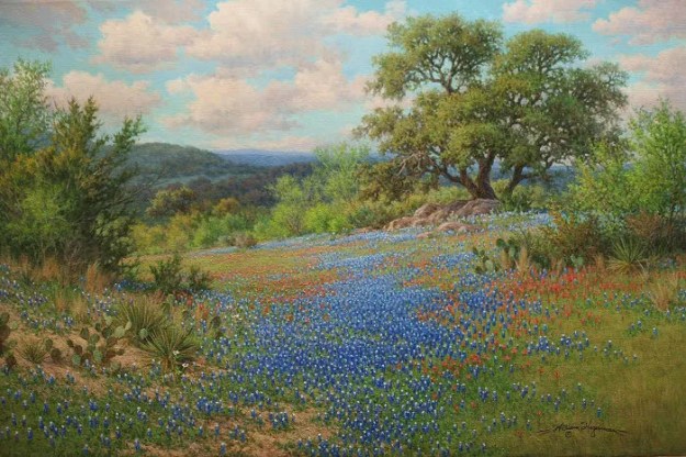
First up is the completed scene of “Interwoven Harmonies,” for reference.

William Hagerman oil painting Texas bluebonnet and Indian Paintbrush

The Journey

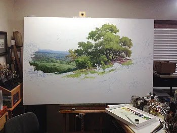
The painting’s journey begins as usual with a composition sketch using thinned ultramarine blue paint and a brush. Color is then applied starting with the darker cedar tree for comparison of adjacent areas. My goal before too many details is to cover the canvas as seen in the next photo.

oil painting demo first steps

Now that the canvas was covered I began adding details to the distant hills. First adjustment was to remove the dark cedar next to the oak tree as my eye went straight to it and it wasn’t a very important element.

Next more interest was added to the sky. Further analysis: Space division in the distant hills were too similar and uninteresting, so here the hills were modified.

The green grass (paint) has dried and now the pattern of bluebonnets and red Indian Paintbrush can begin.

bluebonnet oil painting demo

More flowers are added along with a relocation of the rock patch.

More details and more flowers.

oil painting bluebonnet demo

Our cat Hachi, the day before this photo jumped onto my palette and got ultramarine blue and umber on his paws. I told him if he wanted to paint to make himself useful and add in some more bluebonnets for me. I think he’s got some talent. He removed the patchy dirt and took out the yucca type plants on the right. Then he added a patch of dirt around the other cluster of yucca on the left. That was a good idea. However, at this point he told me he no longer wanted to be an artist. Painting bluebonnets was just too much work.

talented cat tired of oil painting

Despite Hachi’s talent he still didn’t address other weak areas. So here I’ve highlighted those stumbling blocks to a viewers journey in the painting.

oil painting demo analysis

Here you will see how some of the issues above were handled. Then I encountered another strange visual of an unintended tangent line that was noticeable from a distance in the bluebonnet patch.

bluebonnet painting demo

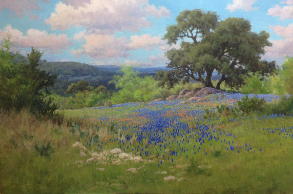
Once again here’s the final painting for comparison. You’ll notice that another cloud was added to break the visual line of clouds as well as fixing the tangent line in the bluebonnet patch. Other tweaks were added here and there.

William Hagerman oil painting Texas bluebonnet and Indian Paintbrush

In Conclusion

Painting is about making choices. The end result is you want your viewer to go on the journey through your painting as you intend without tripping them up. Remember, that even if something is there in a reference, you don’t have to put it in. You can add and subtract elements, redesign them to enhance the visual impact of your work. I hope my “self critique” has illustrated that little improvements can make for a bigger visual impact and pleasant journey for your viewers.


Oil Painting Video Demo: Old Barns

In this post I wanted to share with you a short two-minute Oil Painting Video Demo: Old Barns.

Alla Prima or the Direct Method of Painting

In this tutorial, the subject of old tin barns, which were found in New Mexico made a nice subject for this painting demonstration. The direct method or alla prima approach was used in which the entire painting was completed in one session.

Oil Painting Tutorial; Old New Mexico Barns

Thanks for watching!

Refining the Focal Area

In this segment on my oil painting demo of Paris France, “serious” work begins with refining the focal area, starting with the shadowed side of the middle building. This was done so the values of the adjacent sky and distant building in the sunlight could be judged against it. Cool reflected sky colors were added into the shadowed side which helps it recede.

oil painting demo refining a focal area by Byron

Work continued downward painting in the section between the two main buildings and into the courtyard area. Once dry the wrought iron gate was painted over it keeping the detail to a minimum with just enough to express its character.

oil painting demo paris france wrought iron gate entry

COMPOSITION REFINEMENT

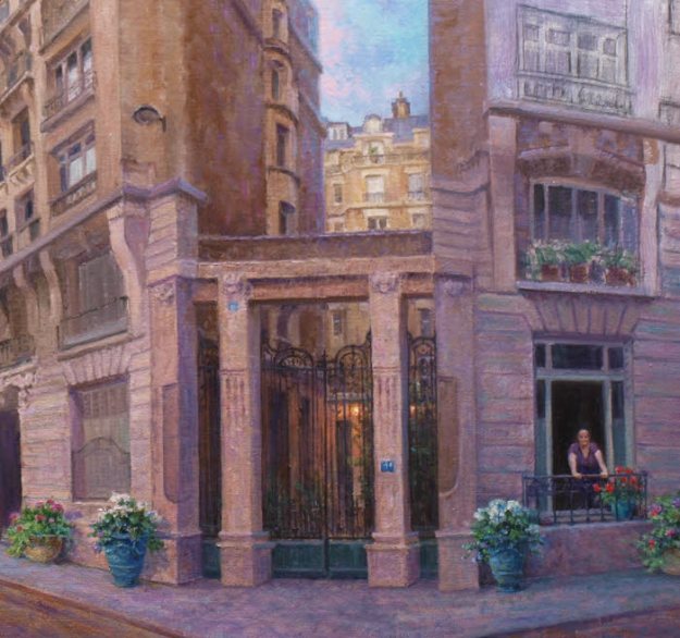
Two important compositional changes in refining the focal area were also made from the original drawing. First, the woman pedestrian in the foreground returned to her apartment. She forgot something so she had to go. Her purpose was to act as a jump point for the eye to travel through the scene. However, a simpler approach of adding more potted flowers would serve the same purpose. Additionally, more emphasis is shifted to my client’s wife in the window. Blue colored French style planters brings balance to each side of the entry way. Plus it allowed more of my clients favorite colors to be added into the scene.

A slight fractional increase in the size of my clients wife in the window was the second compositional change along with changing her outfit’s color to purple, her favorite color. Adding a spot of red in the potted Geraniums next to her also prompts the eye to move to that area.

That warm touch of red adds a bit of color contrast to an area composed of cool colors. The reason for all these tones of violet, blue and even cool greens in this side of the building is that it’s at a different angle to the light. Therefore, being in shadow, it receives more reflected light from the sky.

PROGRESS

The next phase of work begins with painting in the light side of the middle building. Once this is dry, perspective angles will be checked and redrawn if necessary. More refinements and details will be added. Don’t misunderstand the term detail. This can also mean simplify and with so much architectural motifs on these buildings they need to be played down and that can be even more difficult than rendering them in tight detail.

Again the painting is not about the architecture, but my client’s wife and the time they shared in Paris. Everything in the painting has to support this concept. Additionally per their request the painting needs to be kept more impressionistic. In the end some elements will likely be softened. Even with buildings you can’t have all hard edges!

oil painting demo paris street scene

Hope you’ll come back to see more.


OIL PAINTING DEMO of PARIS FRANCE

In Part two of my Oil painting demo of Paris France, the use of fluid washes of transparent and semi transparent color are higlighted. Liquin thinned with Turpenoid was mixed with paint and applied over the drawing. This is called the…

BLOCK IN STAGE

These thin color marks set the the mood of the painting. The lines of the drawing were reinforced with thinned paint in the previous session and left to dry. Therefore these washes would not disturb my careful drawing!

With the wash having set up a bit, opaque color was added to certain passages. This is most noticeable in the trees, cirtroen car and people. Keep in mind, nothing is complete at this stage.

oil painting demo paris street scene

COLOR CHOICES

My clients favorite colors included purple, blue and green. Therefore various mixes of violet and blue dominate the underpainting. Orange, being the compliment of blue is added to the sky. Also a transparent wash of orange is brushed over the street area. Various opaque broken colors of violet and blue violet are added on top. Some of the orange underpainting shows through which gives a sparkle effect.

oil painting demo paris france street scene

Here’s another zoomed in area. Remember the paint is being applied in a very transparent and loose manner. Refining details will come later.

oil painting detail block in stage demo painting paris france

A HINT OF MONET

Artist Claude Monet, founder of the French Impressionists, is a favorite of my clients wife. Therefore my alter ego is attempting to add a little hint of Monet in the brush work. If you look at the following detail of a Monet painting you’ll observe that nothing is just one color. This multitude of smaller flecks of color when viewed from a distance will come together producing a visual mixture!

My underpainting reminds me to render a similar effect in future sessions as more opaque thick colors are applied.

detail of claude monet painting

Thanks for visiting today! More sharing to come!


Commissioned Oil Painting of Paris France

With my latest commissioned oil painting of Paris France, a unique perspective drawing challenge arose that required a judicious amount of artistic license.

My client and his wife visited the Musée d’Orsay in Paris France due to her love of impressionist art. Desiring an impressionist painting as a reminder of their trip which included staying in a lovely rented apartment near the Eiffel Tower.

The inspiration photo was taken using an iPhone in panoramic mode which created extreme distortion.  As you can see, Paris looks to be in the midst of an earthquake! My client’s wife in the window doesn’t seem to notice.

Here’s what was done to stop the earthquake and turn an unbelievable perspective into an artistic arrangement.

A LITTLE HELP FROM A PHOTO PROGRAM

Using a free photo program (GIMP) and its perspective tool to straighten up the buildings was the first task. Although it’s not really a perspective tool as it couldn’t correct everything.

With a supplied street address, and using Google’s Street View a better understanding of the surroundings was achieved. In reality, the buildings are parallel. However, with two unchangeable elements, (client’s wife looking out the window at her husband and the Eiffel Tower in view) the scene cannot be painted as it actually is.

Paris street view

ARTISTS LICENSE TO THE RESCUE

To make the scene believable imagine the buildings as being pie shaped and positioned at a corner street. To strengthen the concept, a mock up of paper was used to represent the buildings and then positioned at a corner of a table which represents the edge of the street.

Mock paper buildings for perspective

Equipped with this information work began on a modified photo/drawing montage. Height was added so the street could be included. Adding a vintage Citroen car and some other people, it kept Paris from looking deserted. These “extras” will act as visual aids in leading the eye through the composition. Ultimately color will also play a part in directing the eye back to my client’s wife and enliven the composition.

oil painting composition of Paris and Eiffel Tower

Here’s the completed drawing on canvas which is 15×30 in size. I’m sure more adjustments in perspective will be made as I paint. Being primarily a landscape artist this has been a fun challenge for my alter ego Byron!

Composition on canvas of Paris. Commissioned painting by Byron copyright 2017

Stay tuned as work on the painting continues. More sharing to come!

How to Paint Bluebonnets

How to paint bluebonnets is the the focus here in part 4 of my oil painting demo series of posts on painting a Texas bluebonnet landscape.

First, I want to show the completed painting. This will give you an idea of where the painting is going. Click on the image for a larger view.

bluebonnet oil painting by William "Byron" Hagerman

I set the stage for the bluebonnets by putting in the grasses working from back to front. I darken the values as I come forward.

part4_1sml

Next I work to cover the rest of the canvas. I’m not focusing heavily on details at this point, just getting my under-painting done. For some of the textures of the grasses I like to use an old jagged edged bristle fan brush.

part4_2sml

After the paint dries I then move on to massing in the bluebonnets with a dark value of blue based off of Ultramarine. I departed somewhat in my traditional mixture by adding Indanthrene Blue by Winsor & Newton into the mix. Since bluebonnets lean towards blue violet I also add in some Dioxine Purple or add Permanent Rose or Alizarin for variety.

part4_3sml

I continue with my dark mix for the bluebonnets, working out a pattern that leads the eye back into the painting.

part4_4sml

After this layer dries I start adding lighter values for the bluebonnets working from the back to front.

part4_5sml

Here’s a detail of the bluebonnets.

how to paint bluebonnets

Another up close view of the painted bluebonnets.

part4_7sml

Once I finished all the bluebonnets I proceeded to other areas of the painting that needed the finish work such as the big tree, rocks, and cactus and a little bit of cutting back into the bluebonnets here and there with the grass color. I wanted to make sure they didn’t look as though they were floating and make the pattern more pleasing and believable.

The following are up close sections so you can see more of the finished detail. As you can see I’ve kept tight detail to a minimum. However, due to the size of the painting it looks more detailed than it really is. I first finish the pattern of the foliage with light dark and middle values. Then I add tree limbs. When dry I negative shape paint the sky holes, chiseling out the forms of limbs and further modifying the shape of the tree.

part5_oaktreedetail_sml

Another patch of completed bluebonnets and surrounding vegetation and rocks.

part5_bluebonnetdetail_sml

Detail of the middle ground cactus.

part5_cactusdetail_sml

Here’s the cactus in the foreground. Here you can see some individual bluebonnets scattered around although not haphazardly. I’m keeping my design in mind. These bluebonnets are a supportive role to the larger masses. Again on the topic of how to paint bluebonnets, notice how the bluebonnets have a dark value, followed by a lighter value and finally a white cap on top. It gives the flowers depth. Also some of the cactus stickers are hinted at. However, in the above image I have not added them except for a few catching the light. Why? They’re further away and your eye would not pick up that kind of detail. Plus the amount of detail has to be in proportion to the rest of the details in the painting. In other words, if your painting is more impressionistic would it make sense to add a bunch of tight detail on an object and leave the rest loosely painted. This might work on a close up view and keeping a background simple, but remember to keep your overall painting in mind and don’t get caught up in rendering details and loose focus on the whole. Every section has to relate to the other.

part5_foregroundcactus_sml

Below is a detail section of rocks. Remember a rock is a shape. It has sides and how the rock is positioned in relation to the light you will have different values. If only two sides are visible you will have a a light and shadow area. The same is true if you can see three sides, but you will have three values at a minimum. Light, mid value and shadow.  Don’t put your sunlight colors in areas that are to be in shadow or put shadow colors in areas that are in the light. Colors in the light are warmer, those in shadow are cooler, but sometimes they can appear somewhat warmer due to a warm reflected light bouncing off other warm colored rocks in sunshine. You learn to paint rocks by studying them. No good substitute for observing them and paying attention to how the light describes their form.

part5_rockdetail_sml

Here’s the detail area of the tree on the left and a view of the distant hills and lower sky. In painting the tree the sequence is establish the foliage first, them indicate limb structure and finally paint in the negative shapes on the sides of the limbs and other sky holes keeping in mind what’s in behind the tree. Often you will have to paint those values a little darker since they can appear to be stuck on top of the tree instead of being behind it. You can also modify the sky hole a little by overlapping it with some tree foliage.

part5_treehilldetail_sml

And finally here’s another close up view of the clouds in the right hand corner area. Again like any other shape a cloud has form to it and as such is subject to having light and shadow sides. Best way to learn to paint clouds is by actually studying them.

part5_clouddetail_sml

I hope that these series of posts will benefit you in your own painting.  Have fun learning!


Painting Clouds an Oil Painting Demo

Here in part 3 of my oil painting demo of a Texas landscape I move on to painting clouds and the sky.

To begin the sky I start at the horizon. I do this to judge my values against the distant hill and values on the shadowed side of the tree up against the sky area. Click image to see a larger view.

painting clouds oil painting demo

Just as in the landscape portion of the painting the goal is to achieve a sense of distance. It is not some blue flat backdrop for the rest of the painting. There is aerial perspective in the sky and a diminishing size on the clouds as they move into the distance. The amount of dust particles or other adulterants floating in the air has an effect on the colors as the recede just as in the landscape portion. Typically white clouds are somewhat “whiter” for lack of a better word closer to you with often a discernible shift in the color of the white portion of the clouds towards orange to a pinkish hue near the horizon.

In the photo below of some white clouds you can see what I’m talking about somewhat at least. Notice how the whites have shifted to a pinkish gray towards the horizon.

color recession in clouds

color recession in clouds

Also the contrast becomes more subtle between the light and shadow areas of the clouds as they recede and colors become grayer. I’m not talking white and black gray here. Just duller in intensity.  I chose a variety of violet grays for this painting. Also be sure to overlap some clouds. This will make your painting more authentic and create a greater sense of depth.

After I establish a few of the clouds I then paint in the rest of the blue portion of the sky.

sky2_sml

Think of the sky of having 3 bands. A top section, middle and bottom and each section is further away. The top has more blue with a touch of red, so I use some ultramarine blue to the middle color which has more phthalo blue in it. The reason is that there is often a yellow element shifting the sky towards green as it recedes. I even use a little phthalo green. But once it gets to the horizon it shifts to a gray.

sky5_sml

Here’s the sky in context to the rest of the painting at this stage.

sky4_sml

In the next session I will move onto the rest of the landscape.


Oil Painting Demo of a Texas Landscape

Here in my second post of my oil painting demo of a Texas Landscape I pick up where I left off in step two.

Since the distant hills are an important secondary area of interest in this painting, I return to add more detail and interest to this area including a distant oak tree and placing of bluebonnets in the distant field. Due to atmospheric perspective all the colors in this area are kept cooler and grayer (less intense) compared to what will be used in the middle and foreground areas to come.

Texas bluebonnet oil painting demo

Feeling I had not yet achieved enough interest I then add another oak tree in the distance. I then move to the far left middle and added the next larger oak with cedar growing underneath and the beginnings of a mesquite tree in front. I like to use an old fan bristle brush that has jagged edges or a cheapo fan brush whereby the hairs break off quickly to mimic the look of the foliage on the mesquite. In spring time the mesquite trees can be an intense yellow green.

bluebonnet oil painting demo

Next in the 5th step I paint in the rock outcropping on the left. When painting rocks remember to think in artistic terms. Don’t think rock, think shapes that will have a top and side planes and they have different values. Light and shadow!

bluebonnet oil painting demo

In my next post I move on to the sky area. Actually I’ve already covered the whole canvas and have started blocking in the middle and foreground bluebonnets. I’ll get caught up on sharing all the steps, but I have a deadline to meet. Busy, busy! Thanks for following along.


Oil Painting Demo | Texas Landscape

In my previous post you learned about my large 48×72 commission painting that is to go into a Military hospital at Ford Hood. Being based in Texas the requested commission was to be a Texas landscape with bluebonnets. In the next several posts I will be sharing the progression of this project as an Oil Painting Demo a Texas landscape.

The first step: ( remember to click on the image for an enlargement)

oil painting demo Texas landscape step one

To begin I started with the large Oak tree. Working with a large flat bristle brush I blocked in the light and shadowed areas of the tree foliage to establish the tree’s form. I then added some limb structure.  You may wish to look at this post on How to Paint a Tree which is a very basic approach. Now that I have a basis to compare and judge other color and values I move on to the section behind the large tree. I also established some of the rock outcropping underneath and in front of the tree.

After this painting session I moved to the next adjacent area of importance. The distant hills.

oil painting demo a Texas landscapae with bluebonnets step two

I started with the distant hill with white, ultramarine blue and a speck of cadmium orange to gray it. As the next hill progressed forward I darkened the blue mix with more ultramarine blue. It also made it more intense and less blue gray.  The next layer of hills start showing some structure of trees. It’s a simple area of light and dark, with the values relatively close in range. Shadows are kept in the blue range with the addition of a little violet. The light areas are variations of warm colored grays, however they are cooler in temperature than the colors closer to us.  One of the grays was made by adding cadmium orange to ultramarine blue and then white. This value represented the light on the trees. Some areas had a spec of green added to the mix, but you have to keep away from any strong yellows or you’ll destroy the atmospheric perspective. Ask yourself, why do blue hills made of green trees look blue? The yellow element is missing.

I’ll continue to refine this area and when complete I’ll be sure to include a close up.