How to Paint Bluebonnets

How to paint bluebonnets is the the focus here in part 4 of my oil painting demo series of posts on painting a Texas bluebonnet landscape.

First, I want to show the completed painting. This will give you an idea of where the painting is going. Click on the image for a larger view.

bluebonnet oil painting by William "Byron" Hagerman

I set the stage for the bluebonnets by putting in the grasses working from back to front. I darken the values as I come forward.

part4_1sml

Next I work to cover the rest of the canvas. I’m not focusing heavily on details at this point, just getting my under-painting done. For some of the textures of the grasses I like to use an old jagged edged bristle fan brush.

part4_2sml

After the paint dries I then move on to massing in the bluebonnets with a dark value of blue based off of Ultramarine. I departed somewhat in my traditional mixture by adding Indanthrene Blue by Winsor & Newton into the mix. Since bluebonnets lean towards blue violet I also add in some Dioxine Purple or add Permanent Rose or Alizarin for variety.

part4_3sml

I continue with my dark mix for the bluebonnets, working out a pattern that leads the eye back into the painting.

part4_4sml

After this layer dries I start adding lighter values for the bluebonnets working from the back to front.

part4_5sml

Here’s a detail of the bluebonnets.

how to paint bluebonnets

Another up close view of the painted bluebonnets.

part4_7sml

Once I finished all the bluebonnets I proceeded to other areas of the painting that needed the finish work such as the big tree, rocks, and cactus and a little bit of cutting back into the bluebonnets here and there with the grass color. I wanted to make sure they didn’t look as though they were floating and make the pattern more pleasing and believable.

The following are up close sections so you can see more of the finished detail. As you can see I’ve kept tight detail to a minimum. However, due to the size of the painting it looks more detailed than it really is. I first finish the pattern of the foliage with light dark and middle values. Then I add tree limbs. When dry I negative shape paint the sky holes, chiseling out the forms of limbs and further modifying the shape of the tree.

part5_oaktreedetail_sml

Another patch of completed bluebonnets and surrounding vegetation and rocks.

part5_bluebonnetdetail_sml

Detail of the middle ground cactus.

part5_cactusdetail_sml

Here’s the cactus in the foreground. Here you can see some individual bluebonnets scattered around although not haphazardly. I’m keeping my design in mind. These bluebonnets are a supportive role to the larger masses. Again on the topic of how to paint bluebonnets, notice how the bluebonnets have a dark value, followed by a lighter value and finally a white cap on top. It gives the flowers depth. Also some of the cactus stickers are hinted at. However, in the above image I have not added them except for a few catching the light. Why? They’re further away and your eye would not pick up that kind of detail. Plus the amount of detail has to be in proportion to the rest of the details in the painting. In other words, if your painting is more impressionistic would it make sense to add a bunch of tight detail on an object and leave the rest loosely painted. This might work on a close up view and keeping a background simple, but remember to keep your overall painting in mind and don’t get caught up in rendering details and loose focus on the whole. Every section has to relate to the other.

part5_foregroundcactus_sml

Below is a detail section of rocks. Remember a rock is a shape. It has sides and how the rock is positioned in relation to the light you will have different values. If only two sides are visible you will have a a light and shadow area. The same is true if you can see three sides, but you will have three values at a minimum. Light, mid value and shadow.  Don’t put your sunlight colors in areas that are to be in shadow or put shadow colors in areas that are in the light. Colors in the light are warmer, those in shadow are cooler, but sometimes they can appear somewhat warmer due to a warm reflected light bouncing off other warm colored rocks in sunshine. You learn to paint rocks by studying them. No good substitute for observing them and paying attention to how the light describes their form.

part5_rockdetail_sml

Here’s the detail area of the tree on the left and a view of the distant hills and lower sky. In painting the tree the sequence is establish the foliage first, them indicate limb structure and finally paint in the negative shapes on the sides of the limbs and other sky holes keeping in mind what’s in behind the tree. Often you will have to paint those values a little darker since they can appear to be stuck on top of the tree instead of being behind it. You can also modify the sky hole a little by overlapping it with some tree foliage.

part5_treehilldetail_sml

And finally here’s another close up view of the clouds in the right hand corner area. Again like any other shape a cloud has form to it and as such is subject to having light and shadow sides. Best way to learn to paint clouds is by actually studying them.

part5_clouddetail_sml

I hope that these series of posts will benefit you in your own painting.  Have fun learning!


Painting Clouds an Oil Painting Demo

Here in part 3 of my oil painting demo of a Texas landscape I move on to painting clouds and the sky.

To begin the sky I start at the horizon. I do this to judge my values against the distant hill and values on the shadowed side of the tree up against the sky area. Click image to see a larger view.

painting clouds oil painting demo

Just as in the landscape portion of the painting the goal is to achieve a sense of distance. It is not some blue flat backdrop for the rest of the painting. There is aerial perspective in the sky and a diminishing size on the clouds as they move into the distance. The amount of dust particles or other adulterants floating in the air has an effect on the colors as the recede just as in the landscape portion. Typically white clouds are somewhat “whiter” for lack of a better word closer to you with often a discernible shift in the color of the white portion of the clouds towards orange to a pinkish hue near the horizon.

In the photo below of some white clouds you can see what I’m talking about somewhat at least. Notice how the whites have shifted to a pinkish gray towards the horizon.

color recession in clouds

color recession in clouds

Also the contrast becomes more subtle between the light and shadow areas of the clouds as they recede and colors become grayer. I’m not talking white and black gray here. Just duller in intensity.  I chose a variety of violet grays for this painting. Also be sure to overlap some clouds. This will make your painting more authentic and create a greater sense of depth.

After I establish a few of the clouds I then paint in the rest of the blue portion of the sky.

sky2_sml

Think of the sky of having 3 bands. A top section, middle and bottom and each section is further away. The top has more blue with a touch of red, so I use some ultramarine blue to the middle color which has more phthalo blue in it. The reason is that there is often a yellow element shifting the sky towards green as it recedes. I even use a little phthalo green. But once it gets to the horizon it shifts to a gray.

sky5_sml

Here’s the sky in context to the rest of the painting at this stage.

sky4_sml

In the next session I will move onto the rest of the landscape.


Oil Painting Demo of a Texas Landscape

Here in my second post of my oil painting demo of a Texas Landscape I pick up where I left off in step two.

Since the distant hills are an important secondary area of interest in this painting, I return to add more detail and interest to this area including a distant oak tree and placing of bluebonnets in the distant field. Due to atmospheric perspective all the colors in this area are kept cooler and grayer (less intense) compared to what will be used in the middle and foreground areas to come.

Texas bluebonnet oil painting demo

Feeling I had not yet achieved enough interest I then add another oak tree in the distance. I then move to the far left middle and added the next larger oak with cedar growing underneath and the beginnings of a mesquite tree in front. I like to use an old fan bristle brush that has jagged edges or a cheapo fan brush whereby the hairs break off quickly to mimic the look of the foliage on the mesquite. In spring time the mesquite trees can be an intense yellow green.

bluebonnet oil painting demo

Next in the 5th step I paint in the rock outcropping on the left. When painting rocks remember to think in artistic terms. Don’t think rock, think shapes that will have a top and side planes and they have different values. Light and shadow!

bluebonnet oil painting demo

In my next post I move on to the sky area. Actually I’ve already covered the whole canvas and have started blocking in the middle and foreground bluebonnets. I’ll get caught up on sharing all the steps, but I have a deadline to meet. Busy, busy! Thanks for following along.


Oil Painting Demo | Texas Landscape

In my previous post you learned about my large 48×72 commission painting that is to go into a Military hospital at Ford Hood. Being based in Texas the requested commission was to be a Texas landscape with bluebonnets. In the next several posts I will be sharing the progression of this project as an Oil Painting Demo a Texas landscape.

The first step: ( remember to click on the image for an enlargement)

oil painting demo Texas landscape step one

To begin I started with the large Oak tree. Working with a large flat bristle brush I blocked in the light and shadowed areas of the tree foliage to establish the tree’s form. I then added some limb structure.  You may wish to look at this post on How to Paint a Tree which is a very basic approach. Now that I have a basis to compare and judge other color and values I move on to the section behind the large tree. I also established some of the rock outcropping underneath and in front of the tree.

After this painting session I moved to the next adjacent area of importance. The distant hills.

oil painting demo a Texas landscapae with bluebonnets step two

I started with the distant hill with white, ultramarine blue and a speck of cadmium orange to gray it. As the next hill progressed forward I darkened the blue mix with more ultramarine blue. It also made it more intense and less blue gray.  The next layer of hills start showing some structure of trees. It’s a simple area of light and dark, with the values relatively close in range. Shadows are kept in the blue range with the addition of a little violet. The light areas are variations of warm colored grays, however they are cooler in temperature than the colors closer to us.  One of the grays was made by adding cadmium orange to ultramarine blue and then white. This value represented the light on the trees. Some areas had a spec of green added to the mix, but you have to keep away from any strong yellows or you’ll destroy the atmospheric perspective. Ask yourself, why do blue hills made of green trees look blue? The yellow element is missing.

I’ll continue to refine this area and when complete I’ll be sure to include a close up.


Landscape Oil Painting Commission

Recently I was contacted by Distinctive Art Source which is one of only two premiere healthcare art consultancies working exclusively in healthcare in the United States requesting a bluebonnet landscape oil painting commission for the National Intrepid Center of Excellence at Fort Hood. The painting is to be displayed in the reception area. When I asked about the size it was to be a 48″x72″ painting and will be under my Byron signature. This allowed me to keep the price within budget.

Aside from working on a couple of murals in the past, this will be my largest studio painting ever! I’m really looking forward to working on this painting.

My first challenge was the canvas itself. The finished work will be shipped rolled. Thus I would need to stretch the canvas in order to paint it, then undo it in order to ship it. Sounded like a lot of extra work. Could it be made simpler? YES!

I found a great product called Genie Canvas. It’s a collapsible canvas. It all comes in a sturdy tube which is reusable and is a rather unique system. No special tools were required to assemble the canvas. Including the time to open the package, laying out the canvas and assembling it took me about 10 minutes.

Here’s a video showing how the canvas is put together.

And here’s my canvas on the easel. You can see part of my sketch on the canvas. It was done so with cobalt blue thinned with Turpenoid (odorless thinner) and a brush. You can click the image for a larger view.

48x72 commissioned oil painting by Byron copyright 2015

48×72 commissioned oil painting by Byron copyright 2015

The painting you partially see leaning on the bottom edge of the canvas is my latest commission for Sherwood Galllery in Houston, TX. Here it is below.


bluebonnet landscape oil painting by William Hagerman

Spring Unfolding 18×24 oil by William Hagerman copyright 2015

I hope you’ll follow along in the next few weeks as I complete this large commissioned painting detailing it’s development.

Facing Artist Rejection

Artist rejected

You’ve just finished your artistic masterpiece and decided it’s surely a potential candidate for winning a top award in some prestigious juried art show. You’ve filled the prospectus out, prepared your images for submission and sent in your money along with a self addressed stamped envelope so you can get your notification. Then you wait for the mail. Finally the day arrives. You open the letter with great anticipation, head swirling at the prospective benefits of this show and as your eyes focus upon the words of this form letter, you read: “Dear artist, thank you for your entry into our Not a Snowball’s Chance in July 10th Anniversary Art Show. We regret to inform you that your work was not selected for this exhibit”…….” REJECTED!!

What?? This is totally unacceptable I’m a MASTER ARTIST!! How can they say my work isn’t worthy to be in their little miserable show.  I’m going to send them my own rejection letter, telling them I have rejected their rejection letter!!! That will teach them to disrespect me! (Uh, don’t do that.)

Facing artist rejection is something every artist will experience at some point. So don’t waste a good stamp or envelope. Build a bridge and get over it. Better yet, don’t let it cause you to miss a beat or one ounce of sleep. Take it from someone who has not only been behind the scenes of a juried art show in not only writing a prospectus and more, but having served on jury panels, as well as being an awards judge, entering  juried shows myself having won awards and yes getting my fair share of those rejection notifications in the mail.

But get this. You’re not being rejected. They probably don’t even know you. So don’t take it personally. It’s not very professional.  Here’s from an inside perspective. As a show organizer, there’s a venue space. It has only so much wall and floor space. I’ll call it wall-estate. It can only display so much art. The organizer wants to have a balanced show. So not every oil painting, or watercolor or pastel or whatever other media is accepted for this show has, could all be shown, now matter how good the work is. Someone has to be cut. There’s also the problem of viewing art whether it’s being projected onto a screen or viewing on a computer. The juror can only make a decision based on the quality of the image they receive. Back in the days of slides I’d see ones that were poorly photographed. Also every painting is projected large. A 9×12 painting will be the same size as a 24×36 on screen. What may look good when viewed actual size doesn’t hold up so well when viewed in this manner. I recall one painting that although accepted didn’t have that much appeal, but when seen in person, it was so much better as you can see it in it’s context. So what an artist submits as regards the quality of the photo is essential but even with a good quality photo there are drawbacks. With digital media, the work may be now viewed on a smaller device, which presents it’s own problems when it comes time to viewing a whole bunch of entries.

Selection is also subjective. Even for the juror, given a different day he or she may select other work and depending on the show, it may receive hundreds or even thousands of entries. A daunting task. There have been situations where one work gets refused in one show only to win best of show in another.

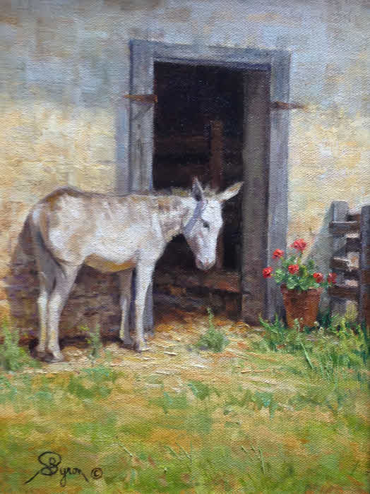
So what if you still feel you missed out on a great opportunity that would have lead to bigger and better things? Let me tell you about an experience I had. Back in 1995 I entered this juried show put on by a legitimate arts association here in Texas. I don’t remember how I found out about the show, but I didn’t know much about it and it was in the days before Google or my having a computer, but it sounded good. Not some small local venue. The show was also to go on tour to several university art galleries. So I thought I’d give it a try. Here’s a picture of the painting I entered.

1995 oil painting titled "The Red Truck"

1995 oil painting titled “The Red Truck”

Guess what? I was accepted! It was juried by some senior curator of exhibitions from some university art gallery up in the state of Washington. There were over 1200 artists nationally who entered and only 48 works by 48 artists were selected and I was one of them. Sounds impressive doesn’t it. I couldn’t attend the opening as it was too far for me to travel at the time, but I got a show catalog. No it wasn’t in color, but still nicely printed. Then I opened the catalog to view the other art. Here’s the kicker. If I could have went and got my painting out of that show I would have. I was appalled at what my work was hanging next to. How about the image of a simple woman’s dress on a hanger that was badly soiled. REALLY? That thing needs to go into the washing machine now! Or how about the one with a mass of zombie looking people with a cow in the midst of them and its head was exploding off into the air. Hmm. Hang that thing in your dining room. I felt like I had just gone down to the police station to purchase an alarm permit, took a wrong turn and somehow found myself in a police line up with several unsavory looking characters. HOW DID I GET IN HERE!!! I threw away the catalog. There was no way I could show that to anyone. I found the show overall to be in poor taste despite the evaluations sent in by host institutions in feeling that this exhibit  was an excellent educational tool for involving and educating their communities about contemporary art.

In my opinion it only presented to the public the view that artists are a bunch of mentally disturbed people who have some severe issues to deal with, based on the imagery seen in the majority of that show.

To this day I do not know why my work was selected or what the state of mind of the juror was in when he picked my work.  I knew something was up when I was contacted by the exhibiting organization if my work could be re-framed as my nice custom frame was too traditional and this was a contemporary art show. Uh oh. The frame they put on it was awful. A simple pale colored wood frame. I wouldn’t have picked that up even if it was in a free box at a garage sale. I’ve seen better moulding at Home Depot. Oh, and when it came time to get my work back my nice original custom frame had been lost.

The painting didn’t sell at that show so I didn’t get any monetary benefit. Plus, I  didn’t receive a single inquire re or any other discernible benefit that helped my art career in any fashion. The only thing is it sounded good on paper. But that’s it. Frankly the expense an artist incurs with juried exhibits often outweigh any perceived benefits.

So if you’re going to put yourself out there and enter these juried shows, remember the expense upon the artist can be costly factoring in the shows fees, shipping etc. and the risk of loss. Plus, they’re subjective, and the opinions of one or a few are at work. If you didn’t get selected it might simply be you got cut because they had to make a decision because of wall-estate. When facing artist rejection do so with your head up. Now if your notification letter was to say something to the effect that they wouldn’t accept your art if you were the last artist on earth, then you can take if personally. Other than that it’s not a reflection on you or your art and even if you do get accepted into one of these shows you might wish you hadn’t.

Finding Artistic Inspiration

Whether one is an artist or not, sometimes we just feel uninspired and our creative side feels drained. There’s an abundance of ideas out there in combating this issue of finding artistic inspiration, but lacking any specific health issue’s that may contribute I wanted to focus on one solution to get your creative energy flowing again. What is that?

unplugged

In today’s world people are plugged in to their electronic media at work and leisure time and elsewhere and sometimes dangerously so. Although electronics like being plugged in, because they draw power which they need, humans don’t recharge that way. For the creative side it drains us of our creative energy. In my artist’s statement I have said when we experience the outdoors, we feel drawn to it, nurtured by it. Being outdoors to enjoy the beauty of nature does have a recharging effect. Studies are showing that disconnecting from our devices and getting outside in nature have shown improvements in creative tasks as opposed to those who were not.

There is so much intricate design in nature that it can’t help but stir creativity when you slow down enough to take a little of it in.

Recently we have been doing some yard work. Even in this confined area of a backyard I started to notice the possibility for a couple of small paintings. A subject that I had not really considered and that of painting flowers in an almost still life setting.  Here below are two small paintings showing how just being outside in my own backyard inspired these two paintings. Not that our backyard looks like this, but what flowers we did have was enough to inspire a little creativity and a departure from my regular subject matter.

Corner Garden

Corner Garden 6×6 oil painting by Byron copyright 2015

The Back Gate

The Back Gate 6×6 oil painting by Byron copyright 2015

So the next time you feel a little run down, try unplugging and get outdoors and start feeling the creative energy returning. Even if it’s in your own backyard! If you don’t have a backyard, try a local park. Look at the trees, the sky, flowers, whatever and let it rejuvenate you.

These two “backyard” nature inspired paintings were recently sold on my eBay auctions as were the nature inspired ones below!

Barn and Hay Bales

Barn and Hay Bales 6×6 oil by Byron copyright 2015

I enjoyed painting this little scene of a little barn with a row of honeysuckle growing in front and some round hay bales. Not sure what the name of the purple flowers were.

blooming_yucca_sml

Dos Yucca 6×6 oil by Byron copyright 2015

I liked the contrast of the yucca up against the dark of the tree behind them.

River Elegance Plein Air

Guadalupe River (River Elegance) plein air 8×10 acrylic and oil painting by William Hagerman revised copyright 2015

This was painted directly from life on location in the Texas Hill Country near Boerne, TX along the Guadalupe River. It had remained in my collection for some time, but is now in its new home.

You can access the auctions from my profile page. Any offerings will be displayed here.

Remember, bidding starts at a penny! Have a great day.


Oil Painting Demo | The Old Window

In today’s post I wanted to share with you an oil painting demo |The Old Window surrounded by Wisteria and geraniums growing in a planter box. This is in my impressionist style, but it’s still similar in approach to how I start a more detailed work.

window1_sml

The first step is to establish my drawing using a small flat bristle rush and thinned paint using turpenoid and a mix of raw sienna + ultramarine blue. You can click on the images to enlarge.

window2_sml

Next using a thin mixture of ultramarine blue + Alizarin Crimson I make a dark purple to block in the interior of the window panes. The upper section is in shadow thus darker.

window3_sml

Next I start painting in the wall with a thin mix of various orange hued tones modified with purple (Alizarin and Ultramarine)  Also I indicate the wisteria vine. The light direction is coming from the upper right indicated by the cast shadow of the window planter box.

window4_sml

I now begin applying some thicker applications of paint to the wall and establish some color for the planter box. I don’t paint all of it, because some of it will be covered with greenery.

window5_sml

I continue adding more color and texture to the wall and the frame around the window. I want my painting to have the appearance of an aged wall.

window6_sml

Here I’ve turned my attention to the window panes still using various mixes of the ultramarine and alizarin. I also added a little transparent oxide red into the darker area to warm the temperature. A little white is added to the violet mix, with a little more ultramarine to shift it to a blue violet for the lower half.

window7_sml

Now I block in some green foliage in the planter box. More yellow green for the light area, cooler greens for the shadow.

window8_sml

I now add my geraniums. Cadmium red light with a pinch of white + cadmium orange for the light side and cadmium red light + alizarin crimson for the shadow with a speck of blue, but not too much. I also finish out the foliage in the planter box and work on the shadows under neath the box.  Next using a small soft flat brush I make short vertical strokes indicating the wisteria blooms using Dioxine Purple + a little white but not too much. Highlights will be added, so this color represents the dark shadowed portion of the blooms.

window9_sml

I continue working on the wisteria vine by adding some texture to the blooms. I used a small soft flat brush with a good edge on it and made some horizontal marks using the same base color for the blooms of Dioxine Purple and white. You’ll notice a few highlights on the blooms in the middle area of the window.

window10_sml

I continue adding highlights on the blooms with a lighter mix of Dioxine Purple and white. I also add some of the vine to connect the blooms. They don’t float in space! In most instances in working with flowers like this it’s best to put the flowers in first and greenery later as you will see in the final step.

window11_sml

Finally I add the greenery of the wisteria vine and some thick opaque yellow green highlights near the mid section of flowers in front of the window. A few thicker applications of paint for the geranium blooms in the sunlight and a few modifications here and there. This painting was completed in one painting session without having to let it dry between stages. This was due to having started with thinner mixtures of paint with turpenoid and a little medium and then thicker applications on top with some Liquin Impasto medium added to the paint. This accelerates the drying of the thicker paint applications.

I hope you enjoyed the oil painting demo | The Old Window!

For further instruction you may enjoy my eBook titled: Creating a Sense of Place in Landscape Painting.

The Old Window painting and two below were featured in one of my eBay auctions. If you would like to receive notices about future auctions, be sure to sign up to receive my periodic update newsletter.

donkey_sml

“Little Fellow” 12×9 Oil by Byron copyright 2015 click here for a larger view


old wagon oil painting by William "Byron" Hagerman

The Old Wagon 12×12 canvas size 8.5×8.5 image size by Byron copyright 2015.Click here for a larger view.


When is a Painting Finished?

Recently I received an email from one of my readers asking when is a painting finished? He himself is a hobbyist painter and struggled with knit picking his work often fixing what isn’t broke.

I told him to take his work as far as his technical ability (skills) and knowledge of painting would allow. Set it aside maybe a day or two and come back and look at it with fresh eyes. Also holding it up to a mirror can often highlight mistakes, since you’re getting a different perspective by looking at it in reverse. If you see something that needs adjustment, then adjust it. Alternatively you can have someone else, perhaps another artist give it a critique. After any changes move on. Often the vitality of a painting can be killed by being overworked.

For myself I finish a work somewhat intuitively. But what are some of the factors or mental questions that I consider? Here are a few and it generally revolves around the visual impact of the painting and have I achieved what I intended for the painting whether it be one of my detailed realistic paintings or one of my impressionist pieces.

I ask myself is the composition still holding up? Does something distract or call too much emphasis away from my center of interest without leading me back to it. I don’t want to lead my viewers eyes off of the canvas into the corner of the frame or onto the wall. Are the colors and values correct? Could it use more or less contrast?

As I told my reader, I do the same; I take my work as far as my knowledge and skill will allow and then stop. If I feel I’ve achieved the goal of the painting, then I move on. Certainly as a person continues to paint and learn your knowledge base grows allowing you to paint with more confidence. However, an artist should always continue to expand and grow and there’s always things to learn and improve upon. Try new things, vary the technique. It builds your repertoire of problem solving and ways to express yourself in paint.


How to Package an Oil Painting

brushes

If you sell your painting to an out-of-state buyer, chances are you’ll need to send the artwork by courier. Of course, this raises practical concerns. What is the best way to package an oil painting? Oil paintings are more susceptible to damage, especially if there are thick areas of the canvas covered with multiple layers of paint.

For this reason, we do not recommend rolling up your oil painting to send in a tube. This is OK for a poster or photographic print but taking an oil painting off its stretcher and rolling it increases the risk of damage. Oil paintings take a long time to dry and are more susceptible to damage from light, heat, humidity, dust and dirt. It’s just not worth risking damage to shave shipping costs, it’s a false economy. If you are on a budget it is best to send the item Economy or use a competitively priced courier service. Choose a professional courier, checking feedback scores and customer reviews as well as prices.

Points to Consider
Will you be sending a framed or unframed canvas? Finding the right balance can be tricky. You want to protect your painting without bulking up its weight.

As an oil painter, your top goal is to ensure your canvas does not get punctured. If your painting is worth a lot, you might want to take the work to a specialist packaging company that custom makes and builds crates for high-value artwork.

1

For the purpose of this post, here is a handy and quick guide on how to package an oil painting for shipping. Keep in mind this is a general, illustrative guide to packaging. The advice can be used for larger works scaling up to accommodate large oil paintings.

Materials Required:

  • Scissors or Stanley Knife( utility knife)
  • Packaging Tape
  • Heavy Duty Black Refuse/Garbage Bags
  • Foam Board
  • Foam sheet
  • Triple-ply cardboard

2

Wrap the Canvas in a Light Layer of Foam
Wrapping your canvas in a light layer of foam, will protect the painting from getting scratched or nicked during transit. Do not use too much foam as the corner protectors will not sit nicely on the edge of the frame. Tape the frame neatly in place as if you were wrapping a delicate gift.

3

Protect the Corners
Extra protection is always a good idea. Most packaging companies offer a range of corner protectors in plastic, foam or cardboard. With unframed oil canvases, it is best if you invest in foam edge and corner protectors. The foam protectors should fit snugly, but not too tightly. If your work is framed, you can use plastic or cardboard protectors. However, these will need to be placed on the frame first before wrapping it in a light layer of foam.

4

Seal from Moisture & Dust
Now that you’ve carefully wrapped your canvas in a light layer of foam and used the corner protectors, it’s time to seal the artwork from moisture and dust with plastic or a heavy duty black refuse/garbage bag. If the bag is significantly bigger than the frame, use a pair of scissors to trim the excess material.

5

Insulate the Canvas
To insulate the canvas you will need insulating foam. It may be difficult to locate insulating foam large enough to accommodate the size of your artwork. If so you may need to use multiple boards, carefully tapping them together to form a sandwich. If your artwork is on the smaller side, you will need to cut out two slabs of insulating foam. Trace the form of the artwork with your Stanley knife to cut out two artwork sized slabs of foam. Use each slab to sandwich the frame.

6

Now, tape the slabs in place as show in the photo. If you cannot access foam slabs, two to three layers of bubble wrap will be a sufficient replacement.


Customs Documents & Shipping Labels
When booking your courier service, most companies provide customs and shipping labels at time of booking. Of course, customs documents will not be necessary if you are sending from one US state to another state. However, if you are shipping abroad, you will need to double check any shipping restrictions for the recipient country. Most companies will auto generate custom forms and labels at time of booking. All you need to do is print these documents out and attach them to your package. It’s recommended if you are shipping abroad to include a duplicate copy inside the box.

7

Box the Artwork
Most packaging companies will wrap artwork with triple-ply cardboard for a custom fit. This also saves using parcel chips and bulking up the package. It’s fairly obvious the bulkier a package is the more you will have to pay to send it. You can achieve a custom fit with cardboard from a flattened box or a purchased sheet of cardboard.

8

Wrapping the artwork is similar to wrapping a boxed gift, just with thicker materials. Score each side of the package, cutting in the corners, so the flaps can be gently folded and taped into place. Fold the flaps around the frame, and tape to secure.

9

Seal the Artwork
Now, that you’ve wrapped the artwork and taped the cardboard in place; it’s time to seal it. Don’t worry if your package isn’t picture perfect. This isn’t an aesthetic exercise. It’s just needs to be secure, so you’ll need to seal the edges at least twice all the way round as show in the photo above.

Attach Labels and Documents
If there is any wording or bar-codes on the box, these will need to be removed, concealed or blacked out with a marker. This will avoid delays when the courier comes to collect. Attach all labels and custom documents carefully to the parcel.

While you may be tempted to roll your painting to save money, it’s not the best way to send oil paintings. You’ve spent hours perfecting your canvas, so why not use the very best packaging materials to safeguard your masterpiece? Your clients will thank you in the end.

This article was written by guest writer Heshaam Hague with Fastlane International, a comprehensive parcel delivery service company that specializes in sending small, large or heavy parcels by economy or express delivery to and from any country in the world.