Reworking an Oil Painting: Before and After

Reworking an oil painting: Before and after photos. Which do you like better?

In composing a painting, sometimes there’s a hard to define problem in which the solution doesn’t come to mind until later. Sometimes, much later. Such was the case with Lapis Hues of Spring a 2013 bluebonnet painting that was shown in a gallery, but never sold. Looking at it once again with a critical eye there was now clarity as to why it would never sell.

Perhaps I was experiencing a dark mood when I painted it, and subsequently cast its ugly shadow onto my painting. It was supposed to be a beautiful sunny spring day in Texas. The painting did not give off that impression.

bluebonnet oil painting

bluebonnet oil painting

Finding a Solution: Sunshine and Openness

The problem wasn’t in paint application or detail or for that matter the basic composition. What was wrong is that the mood of the painting was off. It lacked the feel of sunshine and openness.

Here’s a little exercise for you. Look at the two paintings and notice the differences which are fairly apparent. Click the images for a larger view. But ask yourself, how do the changes you see support the idea of sunshine and openness? You’ll see more openings in the trees. Openings that give glimpses of the landscape further away. There’s more contrast and intensity of colors and a little more variety in flowers and a reduction of the cactus which seemed too imposing in the original image.

A Special Offer

Reworking a painting this long after it was first done is something I rarely do. So with that in mind I’m also doing something I rarely do is offering this William Hagerman signature painting at nearly half for what one this size retails for. Currently this revised painting is offered on eBay as a fixed price item of $1600.00. Normal price for a16x20 varies from $2700- $3000.

Update: This painting is now sold.

My best,

William


Paris France Oil Painting Demo

With this final segment of my Paris France oil painting demo, work is brought to completion. In the previous stage, refinements were made to the focal area.

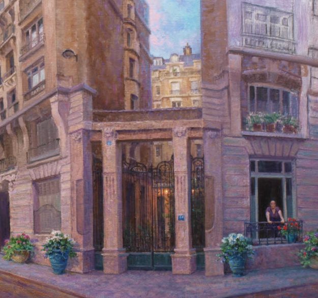
The next step was to work on the building in the upper right which was still unfinished. Since this building is situated at a different angle to the light, it is kept cooler. Brush work is also minimized with sharper detail towards my clients wife in the window. The sharpness of contrast leads your eye to that area.

paris france oil painting demo detail by Byron

Moving On

Now that the primary buildings are mostly done, it’s time to move on to the building on the left. The goal for this section is to keep it more painterly and less detailed. This building brings balance to the heaviness of the composition on the right side, however it should not compete. Therefore, detail was minimized for the same reason as the upper section of the building on the right. Also, the building is in shadow, so all colors are kept to the cool side and kept to a darker value.

After this the next major element to be painted was the Eifel Tower. Enough detail was added to mimic the “texture” of the tower without rendering tight detail which kept it in the distance. Colors are kept subdued and within the overall color scheme. Keeping in mind, the tower although an important element is not the primary subject, but my client’s wife in the window.

Paris France oil painting demo

Painting the Sky

After letting the painting dry, it’s time to go and finish the sky. More intensity of color is added and is applied with thicker paint and bolder brush work. More details and brush work are now added into the distance trees. The lone figure in the distance is painted in as well as the two gentlemen on the left engaged in conversation. A perspective bobble on a vertical line is corrected on the left building. I have so much valued the T-square in this painting!

The street is now repainted to represent the darker brick pavement. To make the street recede colors are kept cooler in the distance and warmer in the front. The basic mix was ultramarine blue and cadmium red medium towards the front with more cooler and lighter violet tones in the distance.

oil painting demo of Paris

THE LAST STAGE of the Paris France Oil Painting Demo

Finally the last of the main elements being the Citroen car and the male figure on the sidewalk are painted in. More detail (subtle highlights) to mimic the texture of the brick street is also added.

A final refinement is bringing a veil of color onto the lower half of the middle building and some added highlights in a few spots. The darkening veil represents a long shadow from the trees in relation to the angle of light. And the few subtle highlights sets up an implied diagonal line from the light source pointing in a downward angle towards the primary subject of my client’s wife the star of the painting!

Oil Painting of a Paris Street scene with Eifell Tower by Byron

Here are a few details. Click the image for a larger view.

oil painting demo of paris france detail

oil painting demo Eifell Tower, paris street scene detail

I hope you’ve enjoyed following along with this Paris France Oil Painting Demo and commissioned painting. If you would like to learn more about commissioned work, please see the following page. COMMISSIONS

A happy customer!

customer of commissioned oil painting by William Byron Hagerman


Color Mixing Workshop

Mixing colors are a challenge for most art students. Therefore,  I recently conducted a one day color mixing workshop. Through a series of exercises, attendees were able to get a clearer understanding of how to analyze and mix paint by doing specific color charts.

Preprinted color charts or those done by others are really of little value. To learn to mix colors, YOU must do the work. Learning comes from the doing, not solely by viewing the end result.

Choosing the colors

The color palette of choice for doing the exercises in the color mixing workshop are listed in the following blog post.

Here’s a short video of the class. It’s also my first attempt at making a video. 🙂 Hope you enjoy it!

Color Mixing Workshop Video

Refining the Focal Area

In this segment on my oil painting demo of Paris France, “serious” work begins with refining the focal area, starting with the shadowed side of the middle building. This was done so the values of the adjacent sky and distant building in the sunlight could be judged against it. Cool reflected sky colors were added into the shadowed side which helps it recede.

oil painting demo refining a focal area by Byron

Work continued downward painting in the section between the two main buildings and into the courtyard area. Once dry the wrought iron gate was painted over it keeping the detail to a minimum with just enough to express its character.

oil painting demo paris france wrought iron gate entry

COMPOSITION REFINEMENT

Two important compositional changes in refining the focal area were also made from the original drawing. First, the woman pedestrian in the foreground returned to her apartment. She forgot something so she had to go. Her purpose was to act as a jump point for the eye to travel through the scene. However, a simpler approach of adding more potted flowers would serve the same purpose. Additionally, more emphasis is shifted to my client’s wife in the window. Blue colored French style planters brings balance to each side of the entry way. Plus it allowed more of my clients favorite colors to be added into the scene.

A slight fractional increase in the size of my clients wife in the window was the second compositional change along with changing her outfit’s color to purple, her favorite color. Adding a spot of red in the potted Geraniums next to her also prompts the eye to move to that area.

That warm touch of red adds a bit of color contrast to an area composed of cool colors. The reason for all these tones of violet, blue and even cool greens in this side of the building is that it’s at a different angle to the light. Therefore, being in shadow, it receives more reflected light from the sky.

PROGRESS

The next phase of work begins with painting in the light side of the middle building. Once this is dry, perspective angles will be checked and redrawn if necessary. More refinements and details will be added. Don’t misunderstand the term detail. This can also mean simplify and with so much architectural motifs on these buildings they need to be played down and that can be even more difficult than rendering them in tight detail.

Again the painting is not about the architecture, but my client’s wife and the time they shared in Paris. Everything in the painting has to support this concept. Additionally per their request the painting needs to be kept more impressionistic. In the end some elements will likely be softened. Even with buildings you can’t have all hard edges!

oil painting demo paris street scene

Hope you’ll come back to see more.


OIL PAINTING DEMO of PARIS FRANCE

In Part two of my Oil painting demo of Paris France, the use of fluid washes of transparent and semi transparent color are higlighted. Liquin thinned with Turpenoid was mixed with paint and applied over the drawing. This is called the…

BLOCK IN STAGE

These thin color marks set the the mood of the painting. The lines of the drawing were reinforced with thinned paint in the previous session and left to dry. Therefore these washes would not disturb my careful drawing!

With the wash having set up a bit, opaque color was added to certain passages. This is most noticeable in the trees, cirtroen car and people. Keep in mind, nothing is complete at this stage.

oil painting demo paris street scene

COLOR CHOICES

My clients favorite colors included purple, blue and green. Therefore various mixes of violet and blue dominate the underpainting. Orange, being the compliment of blue is added to the sky. Also a transparent wash of orange is brushed over the street area. Various opaque broken colors of violet and blue violet are added on top. Some of the orange underpainting shows through which gives a sparkle effect.

oil painting demo paris france street scene

Here’s another zoomed in area. Remember the paint is being applied in a very transparent and loose manner. Refining details will come later.

oil painting detail block in stage demo painting paris france

A HINT OF MONET

Artist Claude Monet, founder of the French Impressionists, is a favorite of my clients wife. Therefore my alter ego is attempting to add a little hint of Monet in the brush work. If you look at the following detail of a Monet painting you’ll observe that nothing is just one color. This multitude of smaller flecks of color when viewed from a distance will come together producing a visual mixture!

My underpainting reminds me to render a similar effect in future sessions as more opaque thick colors are applied.

detail of claude monet painting

Thanks for visiting today! More sharing to come!


Commissioned Oil Painting of Paris France

With my latest commissioned oil painting of Paris France, a unique perspective drawing challenge arose that required a judicious amount of artistic license.

My client and his wife visited the MusĂ©e d’Orsay in Paris France due to her love of impressionist art. Desiring an impressionist painting as a reminder of their trip which included staying in a lovely rented apartment near the Eiffel Tower.

The inspiration photo was taken using an iPhone in panoramic mode which created extreme distortion.  As you can see, Paris looks to be in the midst of an earthquake! My client’s wife in the window doesn’t seem to notice.

Here’s what was done to stop the earthquake and turn an unbelievable perspective into an artistic arrangement.

A LITTLE HELP FROM A PHOTO PROGRAM

Using a free photo program (GIMP) and its perspective tool to straighten up the buildings was the first task. Although it’s not really a perspective tool as it couldn’t correct everything.

With a supplied street address, and using Google’s Street View a better understanding of the surroundings was achieved. In reality, the buildings are parallel. However, with two unchangeable elements, (client’s wife looking out the window at her husband and the Eiffel Tower in view) the scene cannot be painted as it actually is.

Paris street view

ARTISTS LICENSE TO THE RESCUE

To make the scene believable imagine the buildings as being pie shaped and positioned at a corner street. To strengthen the concept, a mock up of paper was used to represent the buildings and then positioned at a corner of a table which represents the edge of the street.

Mock paper buildings for perspective

Equipped with this information work began on a modified photo/drawing montage. Height was added so the street could be included. Adding a vintage Citroen car and some other people, it kept Paris from looking deserted. These “extras” will act as visual aids in leading the eye through the composition. Ultimately color will also play a part in directing the eye back to my client’s wife and enliven the composition.

oil painting composition of Paris and Eiffel Tower

Here’s the completed drawing on canvas which is 15×30 in size. I’m sure more adjustments in perspective will be made as I paint. Being primarily a landscape artist this has been a fun challenge for my alter ego Byron!

Composition on canvas of Paris. Commissioned painting by Byron copyright 2017

Stay tuned as work on the painting continues. More sharing to come!

Are Art Auctions Helping or Hurting the Art Industry?

Are art auctions helping or hurting the art industry? This question arose after talking to two separate art galleries about reasons for the overall sluggish art market. Both mentioned two factors; the economy (which is a given) and how art auction houses are hurting the galleries and artists. A couple of examples below illustrate their concern and it should concern artists as well.

auctioneerIf you do an internet search for art auctions, you may be surprised at the results. There are so many of them compared to former days.  Auction houses make the news when a deceased artist’s work sells for millions of dollars. Or some new artist has caught the fancy of investors hoping to buy and flip the art for profit.

A few short years ago a particular new comer to the arts made the news with his abstract works selling for $100,000.00 and above at auction.  Then the buying frenzy cooled and the same work sold two years later for around $20,000, with the buyer taking a significant loss. The trend is growing.

To illustrate the point further, one well known Texas artist whom I admire had a large 40×60 painting in a recent auction. Normally, the retail value would be in the neighborhood of $50,000. This artist is no newcomer to the art scene and as far back as the mid 1970’s his work was consistently selling for $10,000.00 a clip.  Many artists could only hope to reach that degree of recognition. Appallingly, this lovely 40×60 painting sold for $4600.00 at auction.

ART AUCTIONS THROWING PRICES OUT OF BALANCE

Prices for an artist’s work can be thrown out of balance in either direction of outlandishly high or low. I’m not saying that art auctions don’t have a place. I put some of my small works up for auction on eBay, but those works were developed primarily just for that purpose. It’s structured so it has no bearing on the value of my main body of works.

When it comes to art auctions offering works by living artists, it appears these venues are not helping with stabilizing an already soft art market but throwing it even more out of whack.  It becomes increasingly difficult for artists to keep an established value on their work without unrealistically elevating it or having it crash as if it was nothing more than a commodity on the stock market with the smack of the auctioneers gavel.

RESPECT FOR THE ARTIST PROFESSION

Artists provide a service and through their work bring beauty into the lives of people. In other professions from child day care providers, hair stylists, plumbers, electricians or doctors, people seldom venture to haggle about price.  When handed a bill most pay it for the service and skill of the provider and if they’re especially skilled it’s appreciated.  Artists also possess skills and some especially so, yet are not shown the same courtesy compared to workers in other professions. Almost immediately when an artist offers a fair price for their work to a customer, even on a brand new painting they are expected to lower the price!  After all, they reason that a well known artist with greater credentials sold for a lot less at an art auction!

I treasure one collector who has never once asked for a discount or tried to haggle over a price. Over the years they have bought many paintings and today have one of the largest and best collections of my work anywhere and when they commission a painting I give them my best in return.

So if you really want to help living artists, do this. Buy directly from them, (dead ones don’t need the money) and through their established selling venues such as their own website if offered or through galleries and art shows that they support. In return those artists will more than likely reward you.

So, are art auctions helping or hurting the art industry? What do you think?


Longhorn Cow and Calf (Mama’s Baby)

My latest offer for eBay auction is of a longhorn cow and calf titled Mama’s Baby. I photographed this pair near Poteet, Texas. The bluebonnets this particular year were abundant! You can all but feel the love and affection this Mama has for it’s young.

Bluebonnet oil painting with Texas Longhorn cow and calf by Byron

Mama’s Baby 8×10 oil by Byron copyright 2017

Although I’m primarily a landscape artist I couldn’t help but try my hand at this small 8×10 rendering of two lovely living creatures under my Byron signature.

Don’t miss the auction. It ends Sunday April 30th 8pm central time. Click here to view Mama’s Baby and put in your bid.

I also have two still life paintings as well on auction. Both contain grapes and a couple of my favorite vases. Be sure to check them out!

My Little Vase

Raku Vase

Thanks for visiting today!

How to Choose a Color Palette

When it comes to painting, no two artists seem to agree on how to choose a color palette. After all, painting is subjective as it reflects the temperament of the artist and his or her own color sense. A student or newcomer to painting is often left scratching their head as to what colors are best. It’s then compounded by so many choices as to brands of paint. This post hopefully will adequately address both issues.

how to choose a color palette

COLOR SELECTION

When choosing a palette it should be capable of producing vivid mixtures of all 12 hues on the color wheel.
Basic color theory states that the 3 primaries of yellow, red and blue when intermixed will produce all other colors. Then along with white and black to produce tints and shades of those color is all that’s needed. In reality that’s not the case. What we often think of as being a primary yellow, red and blue from our childhood school days will not produce all the hues on a color wheel to their full spectrum of intensity.

A BETTER CHOICE ON HOW TO CHOOSE A COLOR PALETTE

In printing, inks used to reproduce a color image are yellow, cyan and magenta. Just like your printer at home. Paints closely matching this would be Cadmium Yellow Light or Pale, Permanent Rose or Quinacridone Rose and Phthalo Blue. The intensity of the secondary colors when mixing any two of these primary colors is much improved.

So are these 3 colors enough to produce a full spectrum range? Not really. It can further be improved by adding a purchased premixed color corresponding to one of the secondary colors in the green, violet and orange range. Which ones? The colors of choice are: Cadmium Orange (for Orange), Winsor Newton Permanent Green (for Green) and Dioxazine Purple. (for Violet)  Adding Titanium White and either Ivory or Oxide black and you have a basic set of 6 colors plus white and black.

To get the most intensity, mix your primary with one of these tubed colors to get your remaining intermediate colors which are often referred to as tertiary colors. In the tests that I have done in mixing I found this set up to give a very intense range of spectrum hues. To lower the intensities of these bright colors, you can add its compliment or add a gray from a mixture of approximately half Ivory Black and half Raw Umber. This gray can be added to lower the intensities for most colors except for yellow and yellow orange. Why? The resulting mixture has a green cast. To over come this I mix one other gray for those colors. I use the Black/Umber mix and then add Permanent Rose until it takes on a hue of a dark violet. This will dull the yellow and yellow orange without it shifting green thus keeping it in the right color family.

The List of Basics

  • Cadmium Yellow Light or Pale (yellow)
  • Permanent Rose or Quinacridone Rose (red)
  • Phthalo Blue (Blue)
  • Cadmium Orange (Orange)
  • Dioxazine Purple (Violet)
  • Winsor & Newton Permanent Green (Green)
  • Titanium White
  • Ivory or Oxide Black
  • Raw Umber or Burnt Umber (if you plan to use it with black to make a gray to modify color intensities)

Likely you will not be painting with such vivid colors. To dull the intensity you mix their compliments. In theory those colors are opposite on the color wheel. Sometimes when working with these pigments a compliment that is not directly across may produce a more pleasing result. This is where actually taking your paint and mixing colors is beneficial. If you were a hair stylist you couldn’t call yourself one if you never cut hair. You can’t rely on the work of others. You have to do the work yourself. Mix your own colors. Learn how they interact as you mix. Stop relying on all those printed color wheels and charts. Make your own.

In time, you can add other colors to this basic set. I like having a variety such as the various earth tones in the dull orange and brown ranges such as Burnt Sienna or Transparent Oxide Red and Burnt Umber. Some colors have unique pigments and the way they behave in a mixture can’t be duplicated with this basic set. So having some optional colors expands your color range. In time you will find which colors fit your own aesthetics.

Brands of Paint

Just as deciding on which colors to buy, choosing within what brands can also be daunting from the amount of choices. In my opinion, buy the best you can afford. Price is a pretty good indicator as to quality. Good paints produce better color mixtures. I enjoy some colors in one brand as opposed to the same in another.

In the following link a rather extensive review is given regarding many of the popular brands of paint with pros and cons. I agree (for the most part) with statements on this site. Again it boils down to a personal choice. I hope this will give you a good starting point when it comes to choosing your palette of colors and the available brands of paint that are out there. Happy color mixing!

New Bluebonnet Oil Painting

Springtime came early hear in Texas and due to drier conditions the bluebonnets were not as plentiful, but not my new bluebonnet oil painting! It is full of bluebonnets and rich spring hues.

Titled “Spring Consonance” it resonates with melodic soothing paint tones generated by beautiful morning light and cool shadows.

This larger format measures 24×36 and would make a striking center piece of art for your home or office. Now available at Folger Gallery in Midland, Texas.

(432) 697-3778 * 3211 W. Wadley Ave

bluebonnet oil painting by William Hagerman

Spring Consonance 24×36 oil by William Hagerman copyright 2017 $5500.00

For commissioned work, please feel free to contact me.

Thanks for visiting!