Category Archives: Art Instruction

Refining the Focal Area

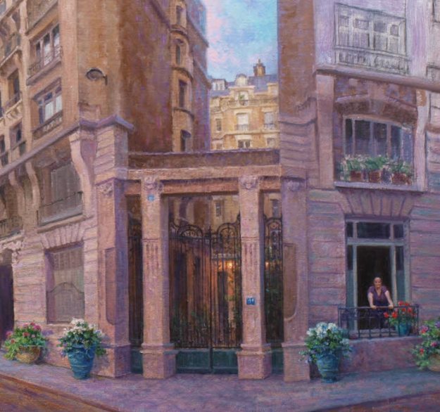
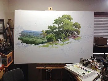
In this segment on my oil painting demo of Paris France, “serious” work begins with refining the focal area, starting with the shadowed side of the middle building. This was done so the values of the adjacent sky and distant building in the sunlight could be judged against it. Cool reflected sky colors were added into the shadowed side which helps it recede.

oil painting demo refining a focal area by Byron

Work continued downward painting in the section between the two main buildings and into the courtyard area. Once dry the wrought iron gate was painted over it keeping the detail to a minimum with just enough to express its character.

oil painting demo paris france wrought iron gate entry

COMPOSITION REFINEMENT

Two important compositional changes in refining the focal area were also made from the original drawing. First, the woman pedestrian in the foreground returned to her apartment. She forgot something so she had to go. Her purpose was to act as a jump point for the eye to travel through the scene. However, a simpler approach of adding more potted flowers would serve the same purpose. Additionally, more emphasis is shifted to my client’s wife in the window. Blue colored French style planters brings balance to each side of the entry way. Plus it allowed more of my clients favorite colors to be added into the scene.

A slight fractional increase in the size of my clients wife in the window was the second compositional change along with changing her outfit’s color to purple, her favorite color. Adding a spot of red in the potted Geraniums next to her also prompts the eye to move to that area.

That warm touch of red adds a bit of color contrast to an area composed of cool colors. The reason for all these tones of violet, blue and even cool greens in this side of the building is that it’s at a different angle to the light. Therefore, being in shadow, it receives more reflected light from the sky.

PROGRESS

The next phase of work begins with painting in the light side of the middle building. Once this is dry, perspective angles will be checked and redrawn if necessary. More refinements and details will be added. Don’t misunderstand the term detail. This can also mean simplify and with so much architectural motifs on these buildings they need to be played down and that can be even more difficult than rendering them in tight detail.

Again the painting is not about the architecture, but my client’s wife and the time they shared in Paris. Everything in the painting has to support this concept. Additionally per their request the painting needs to be kept more impressionistic. In the end some elements will likely be softened. Even with buildings you can’t have all hard edges!

oil painting demo paris street scene

Hope you’ll come back to see more.


How to Choose a Color Palette

When it comes to painting, no two artists seem to agree on how to choose a color palette. After all, painting is subjective as it reflects the temperament of the artist and his or her own color sense. A student or newcomer to painting is often left scratching their head as to what colors are best. It’s then compounded by so many choices as to brands of paint. This post hopefully will adequately address both issues.

how to choose a color palette

COLOR SELECTION

When choosing a palette it should be capable of producing vivid mixtures of all 12 hues on the color wheel.
Basic color theory states that the 3 primaries of yellow, red and blue when intermixed will produce all other colors. Then along with white and black to produce tints and shades of those color is all that’s needed. In reality that’s not the case. What we often think of as being a primary yellow, red and blue from our childhood school days will not produce all the hues on a color wheel to their full spectrum of intensity.

A BETTER CHOICE ON HOW TO CHOOSE A COLOR PALETTE

In printing, inks used to reproduce a color image are yellow, cyan and magenta. Just like your printer at home. Paints closely matching this would be Cadmium Yellow Light or Pale, Permanent Rose or Quinacridone Rose and Phthalo Blue. The intensity of the secondary colors when mixing any two of these primary colors is much improved.

So are these 3 colors enough to produce a full spectrum range? Not really. It can further be improved by adding a purchased premixed color corresponding to one of the secondary colors in the green, violet and orange range. Which ones? The colors of choice are: Cadmium Orange (for Orange), Winsor Newton Permanent Green (for Green) and Dioxazine Purple. (for Violet)  Adding Titanium White and either Ivory or Oxide black and you have a basic set of 6 colors plus white and black.

To get the most intensity, mix your primary with one of these tubed colors to get your remaining intermediate colors which are often referred to as tertiary colors. In the tests that I have done in mixing I found this set up to give a very intense range of spectrum hues. To lower the intensities of these bright colors, you can add its compliment or add a gray from a mixture of approximately half Ivory Black and half Raw Umber. This gray can be added to lower the intensities for most colors except for yellow and yellow orange. Why? The resulting mixture has a green cast. To over come this I mix one other gray for those colors. I use the Black/Umber mix and then add Permanent Rose until it takes on a hue of a dark violet. This will dull the yellow and yellow orange without it shifting green thus keeping it in the right color family.

The List of Basics

  • Cadmium Yellow Light or Pale (yellow)
  • Permanent Rose or Quinacridone Rose (red)
  • Phthalo Blue (Blue)
  • Cadmium Orange (Orange)
  • Dioxazine Purple (Violet)
  • Winsor & Newton Permanent Green (Green)
  • Titanium White
  • Ivory or Oxide Black
  • Raw Umber or Burnt Umber (if you plan to use it with black to make a gray to modify color intensities)

Likely you will not be painting with such vivid colors. To dull the intensity you mix their compliments. In theory those colors are opposite on the color wheel. Sometimes when working with these pigments a compliment that is not directly across may produce a more pleasing result. This is where actually taking your paint and mixing colors is beneficial. If you were a hair stylist you couldn’t call yourself one if you never cut hair. You can’t rely on the work of others. You have to do the work yourself. Mix your own colors. Learn how they interact as you mix. Stop relying on all those printed color wheels and charts. Make your own.

In time, you can add other colors to this basic set. I like having a variety such as the various earth tones in the dull orange and brown ranges such as Burnt Sienna or Transparent Oxide Red and Burnt Umber. Some colors have unique pigments and the way they behave in a mixture can’t be duplicated with this basic set. So having some optional colors expands your color range. In time you will find which colors fit your own aesthetics.

Brands of Paint

Just as deciding on which colors to buy, choosing within what brands can also be daunting from the amount of choices. In my opinion, buy the best you can afford. Price is a pretty good indicator as to quality. Good paints produce better color mixtures. I enjoy some colors in one brand as opposed to the same in another.

In the following link a rather extensive review is given regarding many of the popular brands of paint with pros and cons. I agree (for the most part) with statements on this site. Again it boils down to a personal choice. I hope this will give you a good starting point when it comes to choosing your palette of colors and the available brands of paint that are out there. Happy color mixing!

Benefits of Painting a Still Life

You’re the Conductor!

What are the benefits of painting a still life? This question came back to mind while preparing paintings for my exhibit at the Winnsboro Art & Wine Festival. The show wouldn’t be complete without having a painting or two featuring the fruit of the vine (grapes) which I show here done by my alter ego Byron. A nice departure from my landscapes. There are several benefits of painting a still life and right off the bat you get to be the conductor of your painting!

still life oil painting with grapes vase candle by Byron

My Little Vase 12×9 oil by Byron copyright 2016

Unlike landscapes you get to have total control over the lighting, color harmony and the subject matter. For landscapes you’re at the mercy of the weather. Many times I’ve wished for sunlight but instead overcast skies with no sign of them leaving anytime soon. Or hoping for brilliant fall foliage only to get dull shades of burnt orange or worse, no leaves on the trees! That brings us to another benefit: Timing!

No Timing Constraints; More Benefits of Painting a Still Life

Another advantage of painting a still life is that there are no time constraints. Unless of course you’re on a deadline to complete a painting or if you’re painting flowers and they’ve started to wilt or the fruit is starting to rot then that’s yucky. In which case you might be painting a little too slow. But, aside from those an artist can orchestrate a simple or complex composition as he or she wishes and study the scene at leisure with all it’s intricacies of color, light and shadow as it describes the various forms.

Since the scene is set and unmovable an artist will have ample time to work on drawing from life, which is an invaluable skill as opposed to seeing a flat image (photo) and drawing from it.

Still life paintings are also beneficial in that the objects form is more readily discernible. These forms are often oval, rectangular, cylindrical, cone shaped or combinations. These same geometric forms underlie objects in the landscape. If you learn to properly shade these forms in a still life with a single source of light, you will better understand how to shade other objects whose structure incorporates these various forms in the landscape.

still life oil painting with raku vase grapes orange by Byron

Raku Vase 9×12 oil by Byron copyright 2016

Communicating a Theme

Another benefit of painting a still life, is being able to communicate a story. But, does that mean that all the objects have to relate to one another? If you wish for a rustic theme, does it mean you have to leave out something elegant or vice versa? No! As long as the theme visually harmonizes and creates interest.  As an example here is a frame style combination that is both rustic and elegant. So they can work together, just as in a still life!

frame corner style of rustic and elegance

Rustic and Elegant frame style

The benefits of painting a still life are valuable both to the newbie artist and a good reminder to someone like me who hasn’t tried their hand at a still life in sometime. I have to say it was a lot of fun! Plus, I was able to render each of these still life paintings in one alla prima painting session. (All at once) Perhaps one day I will do a William Hagerman signature still life painting!

Would love to hear your thoughts about my still life work? As the Winnsboro show approaches I’ll be posting more of the art to be in the exhibit. Thanks for reading!

One last reminder before I go, is my latest eBay auction work going on now until 6PM Pacific Time on Tuesday October 18th. Fall is in the air in this mountain setting. Inspired by a trip near Trinidad, Colorado.

The Call of Autumn 9x12 oil by Byron for eBay auction

The Call of Autumn 9×12 oil by Byron for eBay auction

You can access the auction from my eBay profile page.


How to Paint Bluebonnets

How to paint bluebonnets is the the focus here in part 4 of my oil painting demo series of posts on painting a Texas bluebonnet landscape.

First, I want to show the completed painting. This will give you an idea of where the painting is going. Click on the image for a larger view.

bluebonnet oil painting by William "Byron" Hagerman

I set the stage for the bluebonnets by putting in the grasses working from back to front. I darken the values as I come forward.

part4_1sml

Next I work to cover the rest of the canvas. I’m not focusing heavily on details at this point, just getting my under-painting done. For some of the textures of the grasses I like to use an old jagged edged bristle fan brush.

part4_2sml

After the paint dries I then move on to massing in the bluebonnets with a dark value of blue based off of Ultramarine. I departed somewhat in my traditional mixture by adding Indanthrene Blue by Winsor & Newton into the mix. Since bluebonnets lean towards blue violet I also add in some Dioxine Purple or add Permanent Rose or Alizarin for variety.

part4_3sml

I continue with my dark mix for the bluebonnets, working out a pattern that leads the eye back into the painting.

part4_4sml

After this layer dries I start adding lighter values for the bluebonnets working from the back to front.

part4_5sml

Here’s a detail of the bluebonnets.

how to paint bluebonnets

Another up close view of the painted bluebonnets.

part4_7sml

Once I finished all the bluebonnets I proceeded to other areas of the painting that needed the finish work such as the big tree, rocks, and cactus and a little bit of cutting back into the bluebonnets here and there with the grass color. I wanted to make sure they didn’t look as though they were floating and make the pattern more pleasing and believable.

The following are up close sections so you can see more of the finished detail. As you can see I’ve kept tight detail to a minimum. However, due to the size of the painting it looks more detailed than it really is. I first finish the pattern of the foliage with light dark and middle values. Then I add tree limbs. When dry I negative shape paint the sky holes, chiseling out the forms of limbs and further modifying the shape of the tree.

part5_oaktreedetail_sml

Another patch of completed bluebonnets and surrounding vegetation and rocks.

part5_bluebonnetdetail_sml

Detail of the middle ground cactus.

part5_cactusdetail_sml

Here’s the cactus in the foreground. Here you can see some individual bluebonnets scattered around although not haphazardly. I’m keeping my design in mind. These bluebonnets are a supportive role to the larger masses. Again on the topic of how to paint bluebonnets, notice how the bluebonnets have a dark value, followed by a lighter value and finally a white cap on top. It gives the flowers depth. Also some of the cactus stickers are hinted at. However, in the above image I have not added them except for a few catching the light. Why? They’re further away and your eye would not pick up that kind of detail. Plus the amount of detail has to be in proportion to the rest of the details in the painting. In other words, if your painting is more impressionistic would it make sense to add a bunch of tight detail on an object and leave the rest loosely painted. This might work on a close up view and keeping a background simple, but remember to keep your overall painting in mind and don’t get caught up in rendering details and loose focus on the whole. Every section has to relate to the other.

part5_foregroundcactus_sml

Below is a detail section of rocks. Remember a rock is a shape. It has sides and how the rock is positioned in relation to the light you will have different values. If only two sides are visible you will have a a light and shadow area. The same is true if you can see three sides, but you will have three values at a minimum. Light, mid value and shadow.  Don’t put your sunlight colors in areas that are to be in shadow or put shadow colors in areas that are in the light. Colors in the light are warmer, those in shadow are cooler, but sometimes they can appear somewhat warmer due to a warm reflected light bouncing off other warm colored rocks in sunshine. You learn to paint rocks by studying them. No good substitute for observing them and paying attention to how the light describes their form.

part5_rockdetail_sml

Here’s the detail area of the tree on the left and a view of the distant hills and lower sky. In painting the tree the sequence is establish the foliage first, them indicate limb structure and finally paint in the negative shapes on the sides of the limbs and other sky holes keeping in mind what’s in behind the tree. Often you will have to paint those values a little darker since they can appear to be stuck on top of the tree instead of being behind it. You can also modify the sky hole a little by overlapping it with some tree foliage.

part5_treehilldetail_sml

And finally here’s another close up view of the clouds in the right hand corner area. Again like any other shape a cloud has form to it and as such is subject to having light and shadow sides. Best way to learn to paint clouds is by actually studying them.

part5_clouddetail_sml

I hope that these series of posts will benefit you in your own painting.  Have fun learning!


Painting Clouds an Oil Painting Demo

Here in part 3 of my oil painting demo of a Texas landscape I move on to painting clouds and the sky.

To begin the sky I start at the horizon. I do this to judge my values against the distant hill and values on the shadowed side of the tree up against the sky area. Click image to see a larger view.

painting clouds oil painting demo

Just as in the landscape portion of the painting the goal is to achieve a sense of distance. It is not some blue flat backdrop for the rest of the painting. There is aerial perspective in the sky and a diminishing size on the clouds as they move into the distance. The amount of dust particles or other adulterants floating in the air has an effect on the colors as the recede just as in the landscape portion. Typically white clouds are somewhat “whiter” for lack of a better word closer to you with often a discernible shift in the color of the white portion of the clouds towards orange to a pinkish hue near the horizon.

In the photo below of some white clouds you can see what I’m talking about somewhat at least. Notice how the whites have shifted to a pinkish gray towards the horizon.

color recession in clouds

color recession in clouds

Also the contrast becomes more subtle between the light and shadow areas of the clouds as they recede and colors become grayer. I’m not talking white and black gray here. Just duller in intensity.  I chose a variety of violet grays for this painting. Also be sure to overlap some clouds. This will make your painting more authentic and create a greater sense of depth.

After I establish a few of the clouds I then paint in the rest of the blue portion of the sky.

sky2_sml

Think of the sky of having 3 bands. A top section, middle and bottom and each section is further away. The top has more blue with a touch of red, so I use some ultramarine blue to the middle color which has more phthalo blue in it. The reason is that there is often a yellow element shifting the sky towards green as it recedes. I even use a little phthalo green. But once it gets to the horizon it shifts to a gray.

sky5_sml

Here’s the sky in context to the rest of the painting at this stage.

sky4_sml

In the next session I will move onto the rest of the landscape.


Oil Painting Demo of a Texas Landscape

Here in my second post of my oil painting demo of a Texas Landscape I pick up where I left off in step two.

Since the distant hills are an important secondary area of interest in this painting, I return to add more detail and interest to this area including a distant oak tree and placing of bluebonnets in the distant field. Due to atmospheric perspective all the colors in this area are kept cooler and grayer (less intense) compared to what will be used in the middle and foreground areas to come.

Texas bluebonnet oil painting demo

Feeling I had not yet achieved enough interest I then add another oak tree in the distance. I then move to the far left middle and added the next larger oak with cedar growing underneath and the beginnings of a mesquite tree in front. I like to use an old fan bristle brush that has jagged edges or a cheapo fan brush whereby the hairs break off quickly to mimic the look of the foliage on the mesquite. In spring time the mesquite trees can be an intense yellow green.

bluebonnet oil painting demo

Next in the 5th step I paint in the rock outcropping on the left. When painting rocks remember to think in artistic terms. Don’t think rock, think shapes that will have a top and side planes and they have different values. Light and shadow!

bluebonnet oil painting demo

In my next post I move on to the sky area. Actually I’ve already covered the whole canvas and have started blocking in the middle and foreground bluebonnets. I’ll get caught up on sharing all the steps, but I have a deadline to meet. Busy, busy! Thanks for following along.


Oil Painting Demo | Texas Landscape

In my previous post you learned about my large 48×72 commission painting that is to go into a Military hospital at Ford Hood. Being based in Texas the requested commission was to be a Texas landscape with bluebonnets. In the next several posts I will be sharing the progression of this project as an Oil Painting Demo a Texas landscape.

The first step: ( remember to click on the image for an enlargement)

oil painting demo Texas landscape step one

To begin I started with the large Oak tree. Working with a large flat bristle brush I blocked in the light and shadowed areas of the tree foliage to establish the tree’s form. I then added some limb structure.  You may wish to look at this post on How to Paint a Tree which is a very basic approach. Now that I have a basis to compare and judge other color and values I move on to the section behind the large tree. I also established some of the rock outcropping underneath and in front of the tree.

After this painting session I moved to the next adjacent area of importance. The distant hills.

oil painting demo a Texas landscapae with bluebonnets step two

I started with the distant hill with white, ultramarine blue and a speck of cadmium orange to gray it. As the next hill progressed forward I darkened the blue mix with more ultramarine blue. It also made it more intense and less blue gray.  The next layer of hills start showing some structure of trees. It’s a simple area of light and dark, with the values relatively close in range. Shadows are kept in the blue range with the addition of a little violet. The light areas are variations of warm colored grays, however they are cooler in temperature than the colors closer to us.  One of the grays was made by adding cadmium orange to ultramarine blue and then white. This value represented the light on the trees. Some areas had a spec of green added to the mix, but you have to keep away from any strong yellows or you’ll destroy the atmospheric perspective. Ask yourself, why do blue hills made of green trees look blue? The yellow element is missing.

I’ll continue to refine this area and when complete I’ll be sure to include a close up.


Oil Painting Demo | The Old Window

In today’s post I wanted to share with you an oil painting demo |The Old Window surrounded by Wisteria and geraniums growing in a planter box. This is in my impressionist style, but it’s still similar in approach to how I start a more detailed work.

window1_sml

The first step is to establish my drawing using a small flat bristle rush and thinned paint using turpenoid and a mix of raw sienna + ultramarine blue. You can click on the images to enlarge.

window2_sml

Next using a thin mixture of ultramarine blue + Alizarin Crimson I make a dark purple to block in the interior of the window panes. The upper section is in shadow thus darker.

window3_sml

Next I start painting in the wall with a thin mix of various orange hued tones modified with purple (Alizarin and Ultramarine)  Also I indicate the wisteria vine. The light direction is coming from the upper right indicated by the cast shadow of the window planter box.

window4_sml

I now begin applying some thicker applications of paint to the wall and establish some color for the planter box. I don’t paint all of it, because some of it will be covered with greenery.

window5_sml

I continue adding more color and texture to the wall and the frame around the window. I want my painting to have the appearance of an aged wall.

window6_sml

Here I’ve turned my attention to the window panes still using various mixes of the ultramarine and alizarin. I also added a little transparent oxide red into the darker area to warm the temperature. A little white is added to the violet mix, with a little more ultramarine to shift it to a blue violet for the lower half.

window7_sml

Now I block in some green foliage in the planter box. More yellow green for the light area, cooler greens for the shadow.

window8_sml

I now add my geraniums. Cadmium red light with a pinch of white + cadmium orange for the light side and cadmium red light + alizarin crimson for the shadow with a speck of blue, but not too much. I also finish out the foliage in the planter box and work on the shadows under neath the box.  Next using a small soft flat brush I make short vertical strokes indicating the wisteria blooms using Dioxine Purple + a little white but not too much. Highlights will be added, so this color represents the dark shadowed portion of the blooms.

window9_sml

I continue working on the wisteria vine by adding some texture to the blooms. I used a small soft flat brush with a good edge on it and made some horizontal marks using the same base color for the blooms of Dioxine Purple and white. You’ll notice a few highlights on the blooms in the middle area of the window.

window10_sml

I continue adding highlights on the blooms with a lighter mix of Dioxine Purple and white. I also add some of the vine to connect the blooms. They don’t float in space! In most instances in working with flowers like this it’s best to put the flowers in first and greenery later as you will see in the final step.

window11_sml

Finally I add the greenery of the wisteria vine and some thick opaque yellow green highlights near the mid section of flowers in front of the window. A few thicker applications of paint for the geranium blooms in the sunlight and a few modifications here and there. This painting was completed in one painting session without having to let it dry between stages. This was due to having started with thinner mixtures of paint with turpenoid and a little medium and then thicker applications on top with some Liquin Impasto medium added to the paint. This accelerates the drying of the thicker paint applications.

I hope you enjoyed the oil painting demo | The Old Window!

For further instruction you may enjoy my eBook titled: Creating a Sense of Place in Landscape Painting.

The Old Window painting and two below were featured in one of my eBay auctions. If you would like to receive notices about future auctions, be sure to sign up to receive my periodic update newsletter.

donkey_sml

“Little Fellow” 12×9 Oil by Byron copyright 2015 click here for a larger view


old wagon oil painting by William "Byron" Hagerman

The Old Wagon 12×12 canvas size 8.5×8.5 image size by Byron copyright 2015.Click here for a larger view.


Making a Custom Illusion Frame

Part Two:

Continuing with the making of my custom illusion frame, I next painted a fleur di lis design in the four corners using a stencil. I used a lighter gold paint as well as a thin darker outline around the design for a little more contrast. If you missed part one you can read it here.

Custom Illusion frame step 6

Custom Illusion frame step 6

After the fleur di lis design was dry I covered this inner panel area with Folk Art brand acrylic antiquing medium by Plaid Enterprises using a soft cloth to give it a soft aged look. Once dry I masked off another one half inch space from the edge.

Custom Illusion Frame Step 7

Custom Illusion Frame Step 7

I apply acrylic gesso to the masked off section. Once dry I give it a light sanding, and followed with painting it solid black.

Custom Illusion Frame Step 8

Custom Illusion Frame Step 8

After taking off the masking I see that there has been a slight run of the acrylic paint. No problem, I just use some gesso and a small brush to clean up the edges in a few spots.

Custom Illusion Frame Step 9

Custom Illusion Frame Step 9

Next you can see the results of my efforts so far with my custom illusion frame. Remember to click on the photo for a larger view. The larger view for the photo below will show the frame with a side view.

Custom Illusion Frame Step 9 detail

Custom Illusion Frame Step 9

After this I mask off an additional one fourth of an inch extending from the black border which will give a white border around the finished painting. I also masked off the entire frame to protect it while I paint the landscape I have planed for it. I know it doesn’t look too pretty, but it works.

Custom Illusion Frame Step 10

Custom Illusion Frame Step 10

And finally here is the completed result with my impressionist “Byron” painting. So the frame and painting are all part of the art work. In part three of my next post I will share several photos of the painting as I worked on it.

Bluebonnet oil painting by Byron with a custom illusion frame

Completed Custom Illusion Frame with original painting by Byron


How to Improve your Oil Painting by Creating a Story

Another title for this post could be When the Subject isn’t the Subject in a Painting. What do I mean?

The best way to answer that is with an example. Years ago I saw a painting that is an excellent example of what I’m talking about by artist Oleg Stavrowsky titled: Something’s Funny as seen here.

An example of good story telling by artist Oleg Stavrowsky

When you look at it, your eye will travel to the cowboy on the far left, holding his cowboy hat with his extended arm.  From a compositional point of view, he’s the main subject of the painting. Or is he?

The real subject of the painting is not what’s in the painting, but what is going on outside our view that is making these cowboys laugh and take notice. We become engaged as well, wondering what it is that’s making them laugh. It’s a story line that we can take part in. Not that every painting has to tell a story, but it should not be overlooked how an implied story can emotionally engage your viewer. So don’t underestimate the value of how to improve your oil painting by creating a story in your own art work as well as improving the marketability of it.