
Some in the realm of art stress creativity and expressing oneself rather than an understanding of the above artistic painting principles in learning how to oil paint, feeling it’s a hindrance to self expression and not necessary. This simply is an erroneous idea.
To illustrate: Suppose you were handed all the trade tools of an auto mechanic and told to overhaul an automobile engine, yet you know nothing about car engines? How successful would you be? It’s similar to painting. You might acquire all the brushes and paints needed to complete a painting, and then be told to go express yourself and create your masterpiece all the while you might be scratching your head wondering how to mix a particular shade of green or what brush to use to get the effect you want.
In reality, knowing the fundamentals along with practice, allows you to better express yourself with paint and to produce better work.
 Learn How to Oil Paint: The Basics
The following is a general guide of what you will need to know in order to start oil painting.
- Art Supplies-What’s needed.
- Color: How to see it and how to mix it.
- Oil Painting Demo as an example to help you get going.
Getting Started With Art Supplies
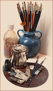
Obviously, to get started in oil painting, you need art supplies. I’ve provided a shopping list for you with my recommendations for a customized basic set that I’ve shared with students who have no supplies. It’s developed with economy in mind, without sacrificing too much in quality. This list is what is suggested to my students enrolled in my art classes. This list can be adapted to your needs with equivalents in similar brands if you prefer and is a starting point. Please click the following link: Oil Painting Art Supply List. (The file is in PDF format)
Some thoughts to consider when buying art supplies:
No two artists seem to agree on what materials to purchase, each having their own opinions and preferences based on their individual experience. However, the materials you use will ultimately have an impact upon your painting experience. Imagine if you will, the tools used in someone’s trade, such as a carpenter. If the worked was performed using poor materials or equipment, how do you think it would impact the quality of the finished work as well as the enjoyment of the work experience itself? Both would suffer and it invites frustration. Therefore with this in mind, a general rule of thumb is to buy the best art materials you can reasonably afford.
Art materials can be grouped into two categories. Professional grade and student grade with variances in quality and price even in these categories. The first noticeable difference is generally the cost, with the artist or professional grade being higher in price. The second noticeable difference is the quality. Student grade brands are obviously designed for economy and lack some of the working properties of the professional grade. My opinion is that a few high quality materials are better than a large quantity of low grade materials. Working with poor art supplies only frustrates the painting process. However, I will say that price doesn’t necessarily equal value. For example, I use a few brushes that are on the low end price wise and the quality isn’t always consistent. (sometimes brush hairs fall out) Despite this occasional drawback, they are priceless to me in the effects I can achieve with them. When they work, they work well.
Also, I do not use just one brand of paint as I like certain qualities of pigment in differing brands. Some of the brand names of artist grade paint I use include: Rembrandt, Winsor & Newton and Schminke Mussini Oils, with a sprinkling of other colors in differing brands.
Learn How to Oil Paint and Mix Colors
One of the first challenges for art students is in mixing color. Understanding it and how it behaves is a fascinating subject and whole books have been written on color theory alone. There’s so much on the subject from how our eyes see it to the psychology of color, not to mention how pigments react in mixture, that it can become rather confusing in a hurry and even frustrating when you just want to know how to mix a particular shade of green. However, it begins with analysis.
There are three main areas to analyze in mixing color and they are: Hue, Intensity and Value.
In simplistic terms Hue is the basic description or classification of a color. (yellow green, violet, blue etc.) Intensity or Chroma is how vivid or intense a color is. (Bright or dull in Hue) The value is how light or dark a Hue is on a scale from almost white to black.
Traditional color theory says that there are 3 primary colors of yellow, red and blue. All other colors are derived from mixing two of these primaries together to get a secondary group of colors (orange, violet and green). The other colors are intermediate or sometimes called tertiary. They are simply variations of the secondary colors. (yellow green, blue green, yellow orange, red orange, blue violet and red violet). All of these make up the basic triad color wheel. To lower the brightness of a color you add its compliment or the color directly across on the color wheel. Example: red and green are compliments. Then to lighten a color add white and to darken add black.
However, in practice the triad color wheel and its basic theory falls short as the colors we typically associate with yellow red and blue do not produce a full spectrum of bright colors.
For further reading see this following blog post.
The video below will show you some basic colors for a beginning set and an example of how to adjust the colors intensity without having to remember what complimentary color to use.
This video is an excerpt from my self paced online video class.
A Video Demo
Pigments: What are they?
In simplest of terms, a pigment is a colored material ground into a fine powder, which is then suspended in some type of media that acts as a binder to hold the pigment together and giving the resulting paint its adhesion. In oil paints, linseed oil is generally used as the binder, except in lighter colors where poppy oil might be used, since it has less tendency to yellow. Another drying oil used in formulating oil paints is walnut oil. 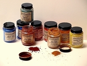
Pigments whether natural organic (mineral based), synthetic organic, or inorganic (carbon-based) are what all paints are made of.
Historically, the earliest of pigments were natural minerals, or biologic in nature. (originating from plants, insects) However, in time synthetic pigments were manufactured or modified from naturally occurring materials expanding the range of colors available today.
For the artist there are some important factors to consider regarding pigments when selecting them for use:
- Lightfastness: Refers to the permanency of color or length of time a pigment retains its original color without change under the ongoing action of daylight. Colors with a low lightfastness rating are considered fugitive in that they do not retain their color over time.
- Stability: The color must not break down with age, or react chemically in a negative way with other colors or even the atmosphere.
- Quality: A good paint should consist of more pigment and highly refined oil such as linseed, without the addition of fillers which are used to extend the volume of paint such as used in student grade paints. Colors with high pigment saturation, last longer, are more vibrant and simply perform better.
Some Common Oil Paints and Their Descriptions
Titanium White
Made from titanium dioxide, this inorganic pigment has a high tinting strength and very good covering power and is considered permanent for artistic purposes. Most colors labeled as titanium also has zinc white added to preserve it’s whiteness and enhance its mixing qualities.
Cadmium Pigments Including Yellows, Orange and Reds
This group of inorganic colors have a commonality in that they all have cadmium as a component in their chemical make up. The main pigments in this family of colors are cadmium sulphides and sulfoselenides. Cadmium Yellow(cadmium sulfide) when mixed with selenium becomes increasingly redder as more selenium is mixed producing a range of color from orange to a deep red. These brightly colored oil paints have good permanency and tinting strength. In some paints these pigments are mixed with barium(barite) which acts as a filler in cheaper paint and should be avoided.
Permanent Rose or Quinacridone Rose
Quinacridone pigments are unique and beautiful colors which have the characteristics of excellent lightfastness, vibrant tones, good tinting properties and transparency. Permanent Rose can be considered a primary red as it’s neither too yellow or blue and makes excellent violets when mixed with blue.
Alizarin Permanent
Originally Alizarin Crimson, an organic lake pigment was derived from the roots of the madder plant and did not have a good lightfastness. Alizarins of today are made more lightfast by using quinacridone pigments. It’s a transparent rich dark red with a slight purplish brown undertone.
Ultramarine Deep
Genuine Ultramarine an inorganic pigment was made from a semi-precious stone called lapis lazuli. It is still made but it is a costly pigment. Other colors having the name ultramarine such as French Ultramarine, Ultramarine Light or Deep is a complex polysulphide of sodium alumino-silicate. It’s a beautiful blue which tends fractionally towards red. It’s transparent with an average to good tinting strength and versatile in mixtures.
Phthalocyanine Blue and Green
The phthalo pigments are organic and derived from copper salts. The blue is a very strong dark color with a greenish undertone. When mixed with white it becomes a turquoise like blue similar to Cerulean Blue. Cerulean Blue Hue is based off this color. The green is a very deep emerald green and when lightened with white is very similar to Viridian Green. These colors are permanent, transparent and have a high degree of tinting strength. A little goes a long way in mixtures.
Raw Sienna, Burnt Sienna, Yellow Ochre, and Burnt Umber
These inorganic colors are natural earth pigments derived from limonite clay containing ferric oxides. Synthetic versions of these pigments are also available on the market today. They are permanent and are useful in many oil painting applications.
Transparent Oxide Red
This variation on the iron oxide manufacturing process produces a beautiful semi-transparent color similar to Burnt Sienna, but with a more luminous quality.
Ivory Black
This and many other blacks are carbon based from various organic and mineral sources. This is sometimes considered an all-purpose black for mixing grays and with other colors and is semi-transparent.
Mars Black or Oxide Black
This is an inorganic synthetic iron oxide, opaque in nature with a warm undertone. It’s considered non-toxic, and is safe for underpainting as it dries to a relatively hard and flexible film. Though not as black in appearance as Ivory Black, it has nearly triple the tinting strength.